Above: Post It comment board from Pick Me Up.
Art for art’s sake
Back in the 1940s and 50s the US government held up to the world as a beacon of freedom, the splash paintings of Jackson Pollock and the colourfield giants of Mark Rothko. These, they said, prove how liberal America is because we can accept this kind of art for art’s sake. It doesn’t have to mean anything. It doesn’t even have to look pretty. It is an expression of the free West. And you, Communist Russia, they said, are terrible because you have quashed your explorative, avant garde artists and have decreed, ruled, that only certain kinds of middle of the road art are acceptable.
Art for art’s sake. Hmm. Cool, why not? Yet Rothko said his works did mean something; something very deep and cosmic and if you could understand it you would be changed.
You cannot not communicate
Potentially anyone can see some message in any form of communication. I see plenty in Rothko’s works. I see the void and back again, dialectical tension like a roller coaster ride. I see meanings in Pollock, but he might not have agreed with me. I see his anger, his masculinity, his experimentation. The Intentional Fallacy, of course, says a maker can never guarantee that his or her meaning will be understood. That is accepted.
So what to make, in terms of philosophical aesthetics – the meaning of art – in this year’s Pick Me Up. I suppose one has to say it is a kind of contemporary banner of freedom of expression. Look! London holds up the work of young collectives as a flag of democratic artiness. The graphic artists can do what they like and we will display it and grimly love it. Hell, we might even have a go at a workshop or buy a small pile of wood for £45.00. Yep. We are free to do all of this and no-one can argue it is wrong. If we add glitter to the word “amazing” it’ll make it amazing, right?
Comparison is the thief of joy
Above: Detail of Mohammed Yousef’s documentary series, Art in the Wild.
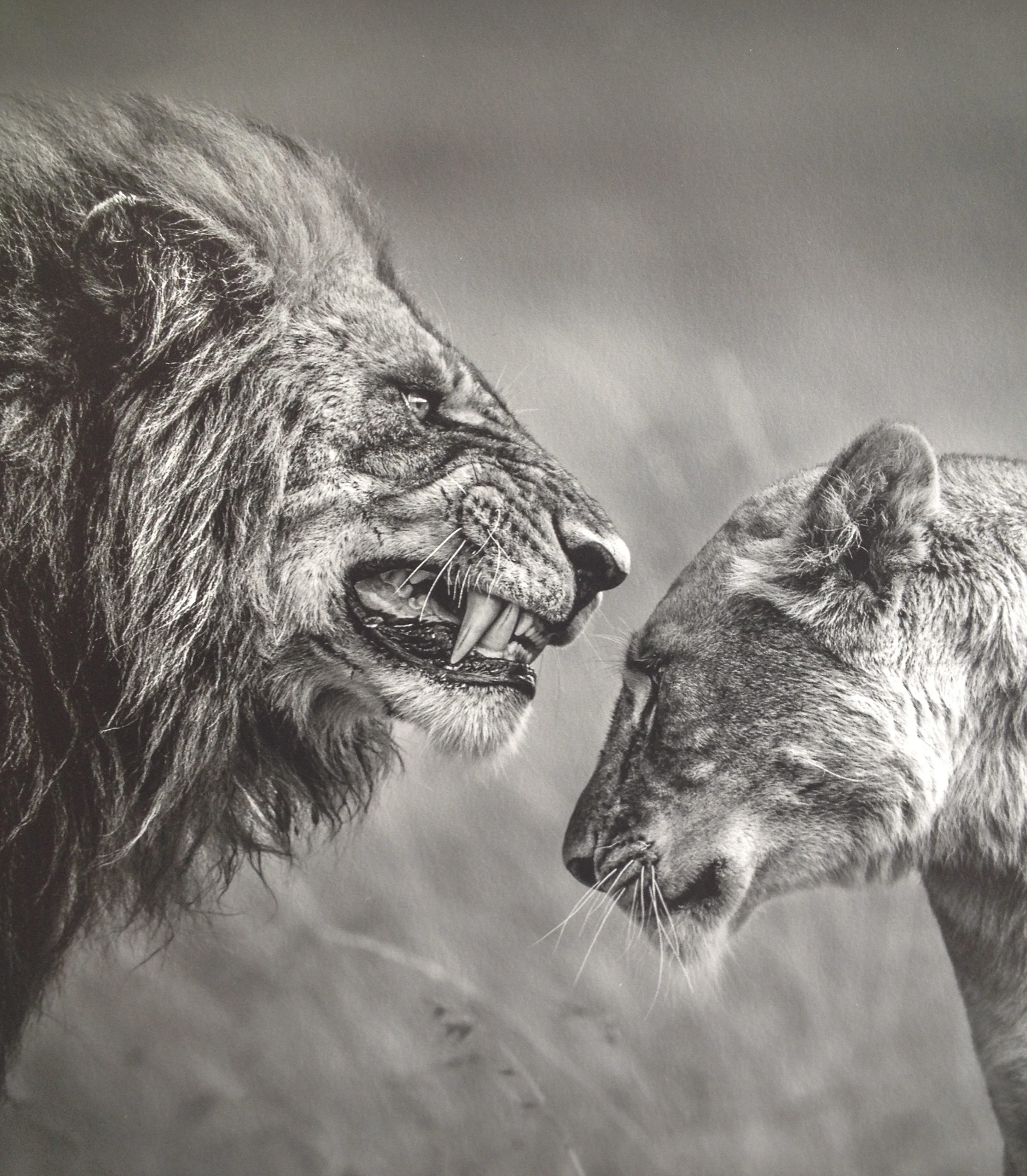
Unfortunately – or perhaps fortunately – I went into the other Somerset House exhibition first, the world’s largest photography competition. The Sony World Photographic Awards 2016 is superb. Each year it is a photographic onslaught of the beautiful, the harrowing, the amusing and the enigmatic from all over the globe. Here you will see the brave documentary photographers smashing secrets, stifling their own emotions to provoke ours, calling for understanding and action. You’ll see very youthful photographers capturing their environments in thoughtful and witty ways that make you proud. You will see sets of photos telling mysterious stories that engage and delight you and occasionally repulse you. It is so full of elements, issues and narratives that you need a sit down or a stiff drink afterwards. But what you do always feel is the sheer, heavyweight value.


Above: Documentary selection from Sony World Photos. Left to right: Giles Clark’s The Bophal Medical Appeal: Toxic Trespass; one of Antoine Repesse’s Unpacked series about packaging pollution; one of Kiki Streitberger’s Travelling Light series depicting the treasures of Syrian refugees.
These photographers want to share the world with us in all its glory or nastiness. Here is art in the form of communication. It communicates through visual elements, composition, colour, scale and often, though not always, through topic. Always you want to know more, to find out the context, the origin and – though we rarely find out – what happened next. Things matter here. They are not always real, in the sense that they are sometimes constructs – photographic paintings and stories created or viewed from specific standpoints. Yet it is art that means something.

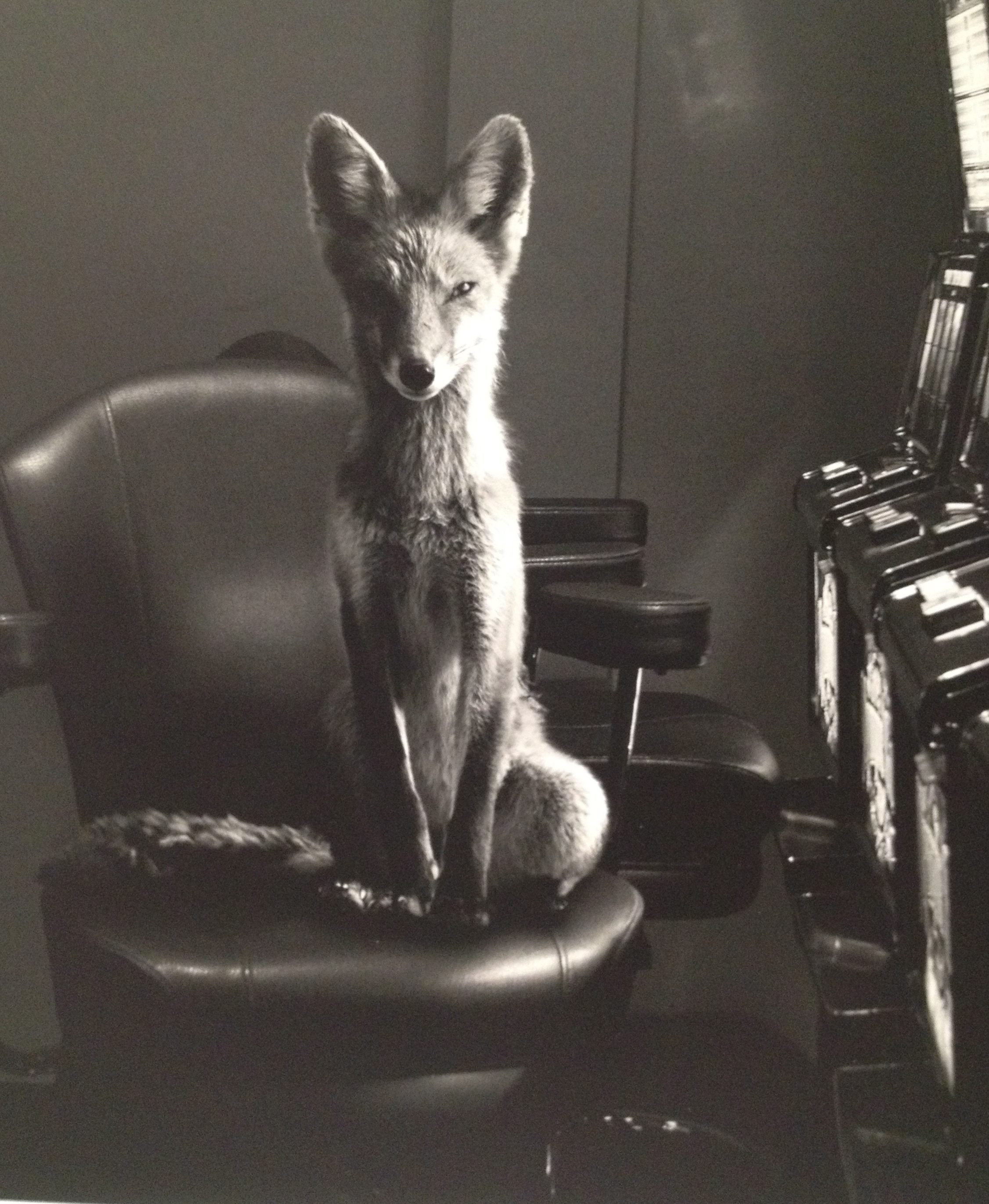


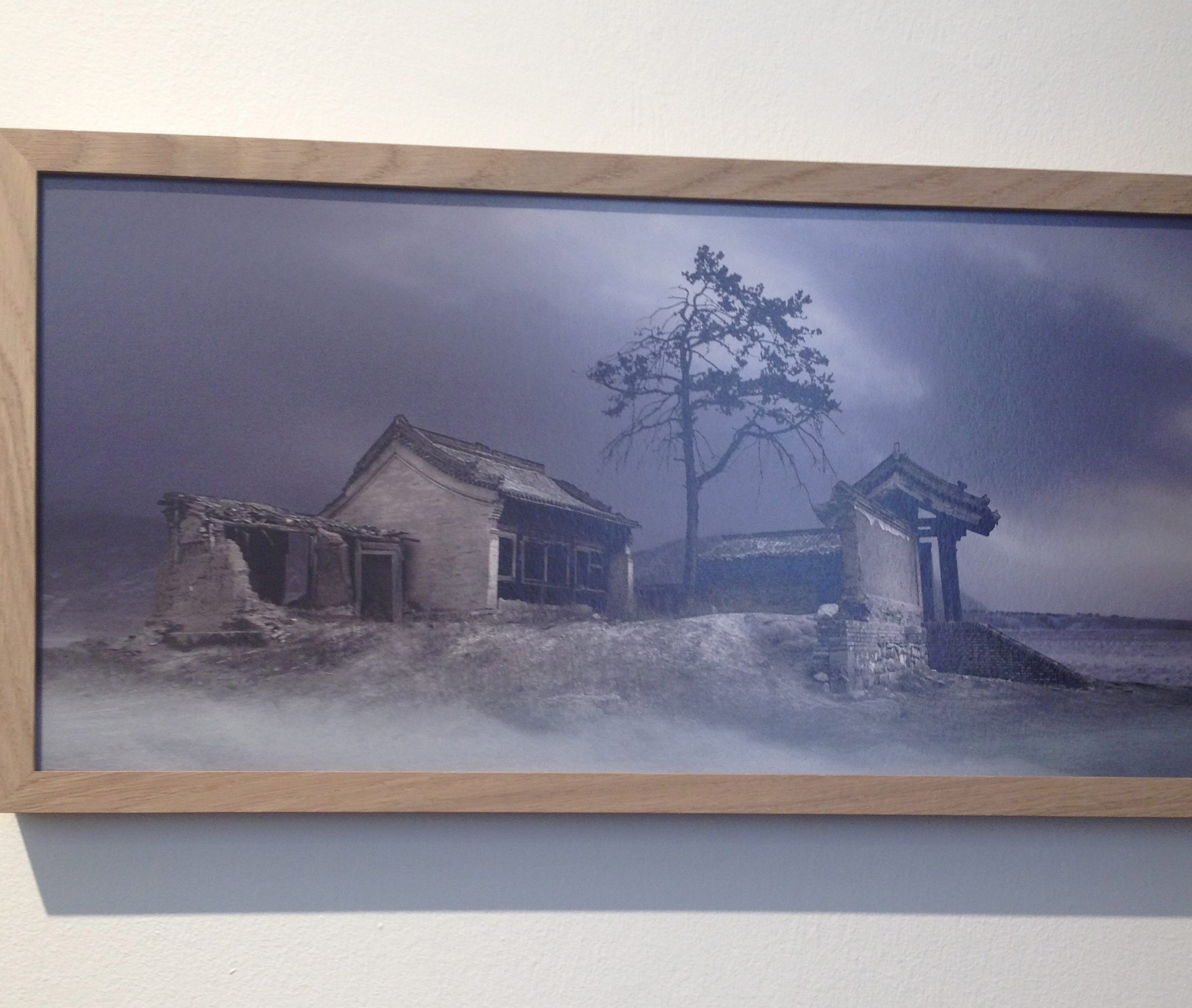
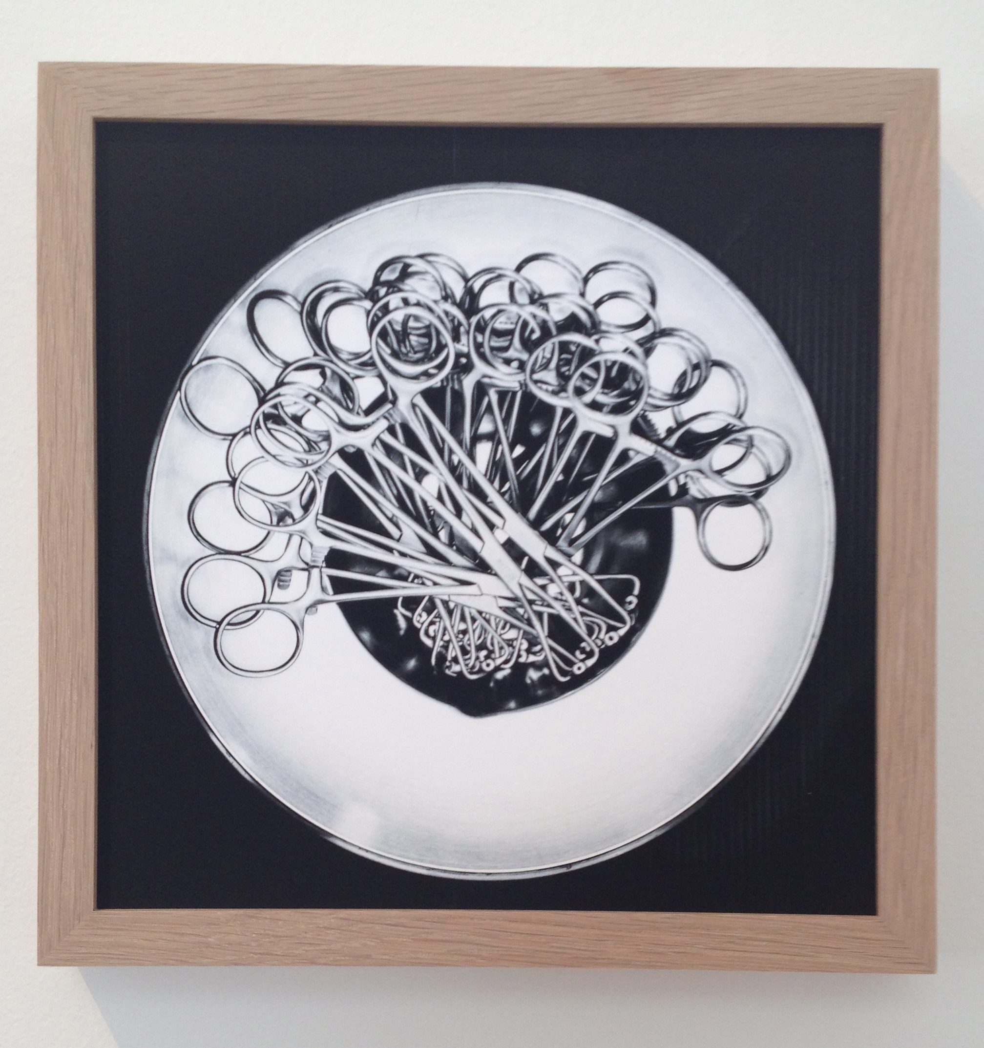
Above left to right: Enrico Finottere, La Boheme, and Taehoon Kim, Eiffel Tower; Jason McGroarty, Totem Fox; Mingzhen Tang’s Untitled pattern of matches; Maoyuan Cui, Ancient Chinese Villages; Daniele Robotti, Surgical Instruments
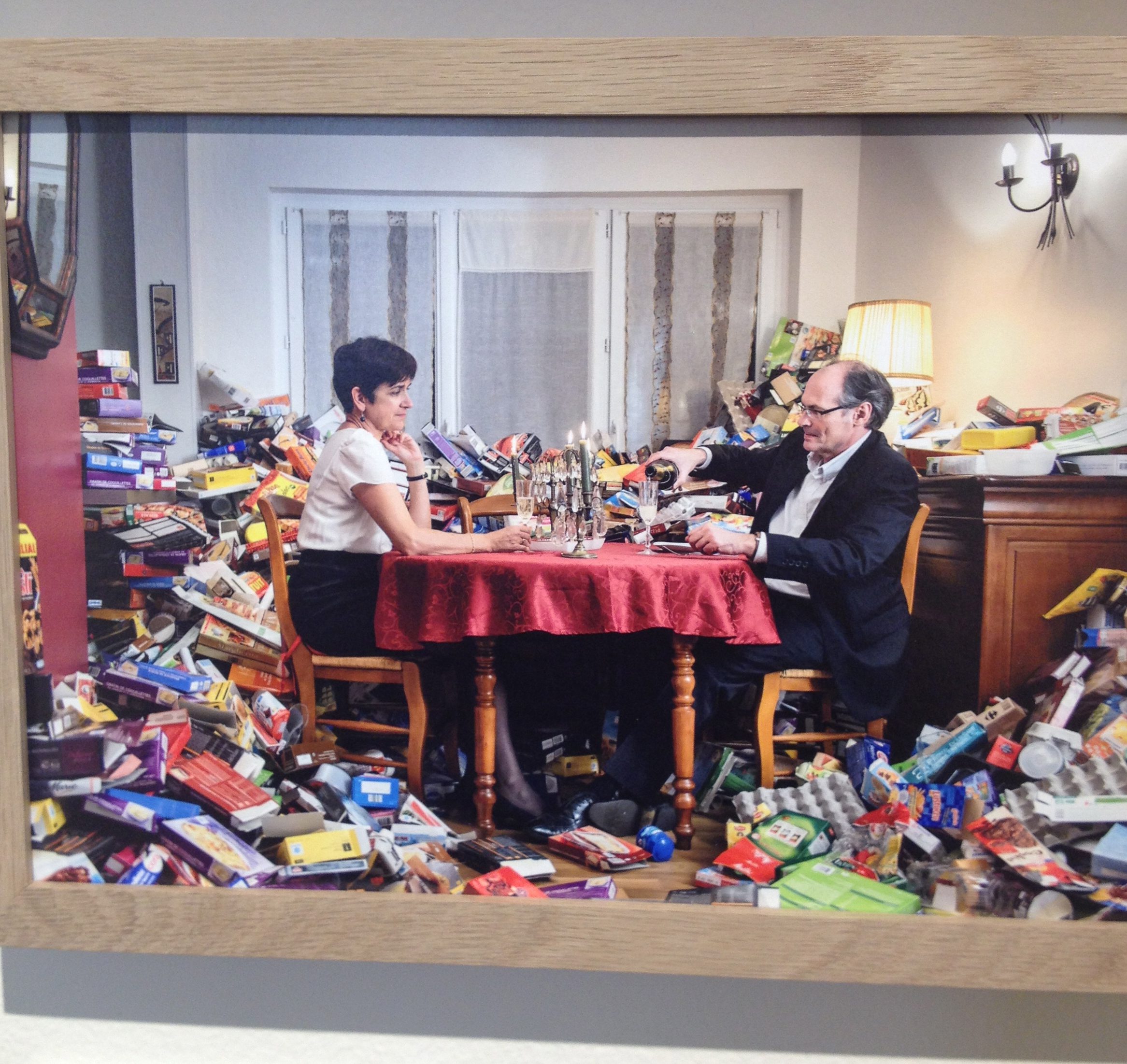
Moreover, this year the curation was a feature in its own right. The photographs were arranged to form patterns of their content. Red curtains through which we glimpse the Eiffel Tower, red theatre curtains slightly opened, red wall with a fox peering underneath, a fox on a stool and so on. Chains of ideas flowed through otherwise unrelated imagery because of the way that they had been assembled. Comparison worked here as a bridge between each scene so we could see lively bodies in the air (divers, gymnasts) against the sharp contrast of buildings or the colour and shape of large architecture. This added richness that helped each photograph yield its subject matter or flavour in a connected way, like complementary dishes in a haute cuisine feast.

Above: Dina Belenko, A Study with Freefall.
Perhaps to go, reeling, from this mental symphony into the (literal) cacophony of Pick Me Up was a bit unfair. My colleague and I have been taking our graphic design students to this show now for, I believe, seven years, since it started. On our first visit we remarked that it was like the story of The Emperor’s New Clothes. You know the one; vain emperor gets conned into paying a huge sum for a magic suit of the finest clothes that only the good and clever could see and doesn’t want to look like an idiot for admitting he cannot see it. The upshot is he parades through his kingdom in his “suit” only for a little boy – who knew no better – to shout out “Why is the Emperor in his underwear?”

Above: Rachel Lillie’s pile of wood Artefact 7 (Gravel Pile) 2016, £45.00.
Nevertheless, annually we joined the Pick Me Up parade and have indeed admired many good qualities. In particular the idea of small collectives working together and producing graphic art is both exciting and provides a counterpoint to big organisations who may or may not be too mainstream. It is an alternative way of being a professional graphic artist and communicator. So why isn’t anyone communicating? OK, so not all art or design or illustration or photography has to be worthy. Of course, some of it can just be for entertainment and fun.

I am certainly not the naive little boy who calls out the lack of the Emperor’s clothes through lack of tainted mediation, experience or agendas. I am not an art innocent. Perhaps I am just a grumpy old woman who can’t understand young people these days. Or more likely, perhaps my own tendencies are more towards activism and Russian Constructivism. Maybe my subjectivity is too much related to the need for communication to say something or to be socially responsible and do something for the global community at large.

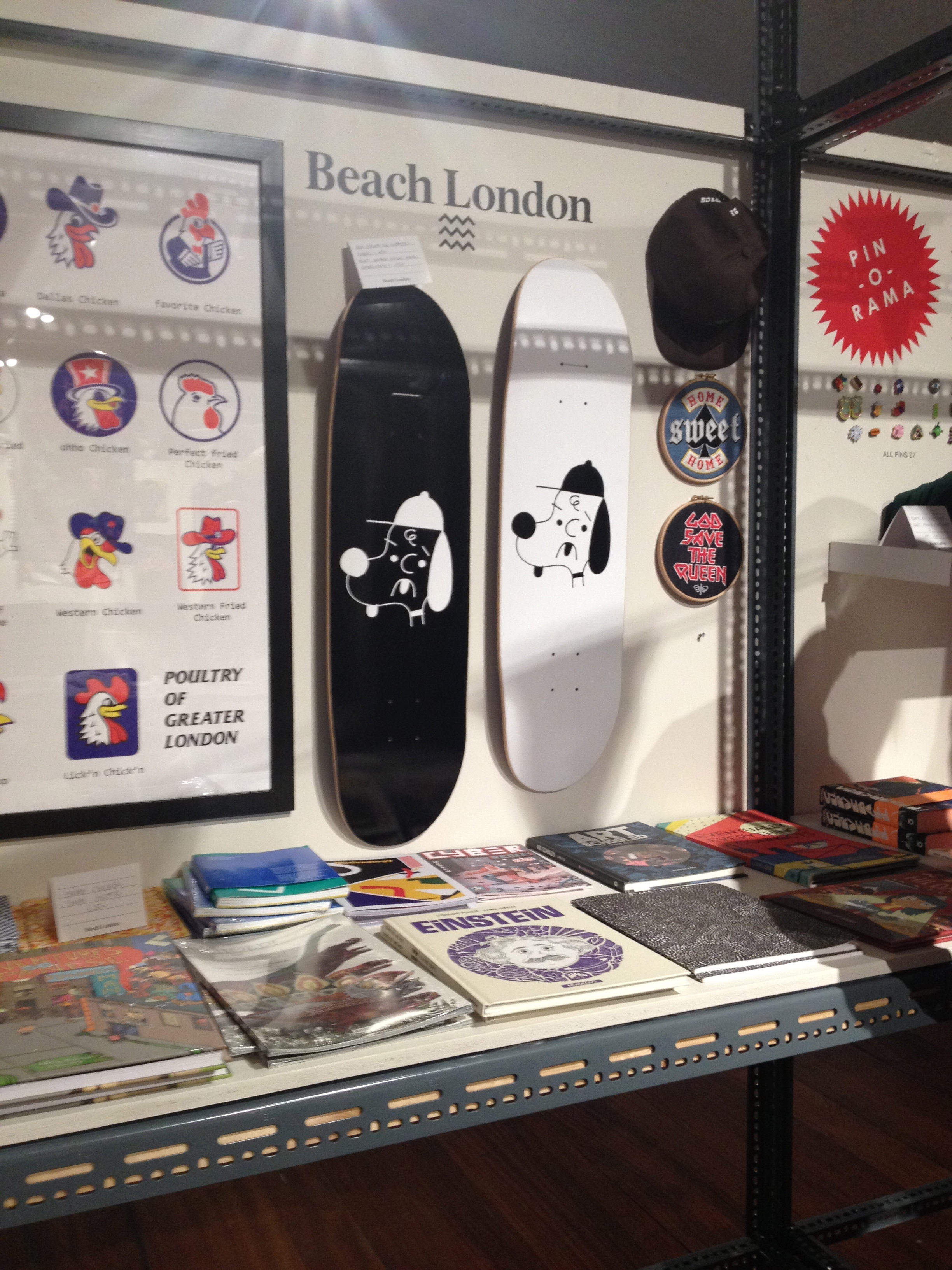
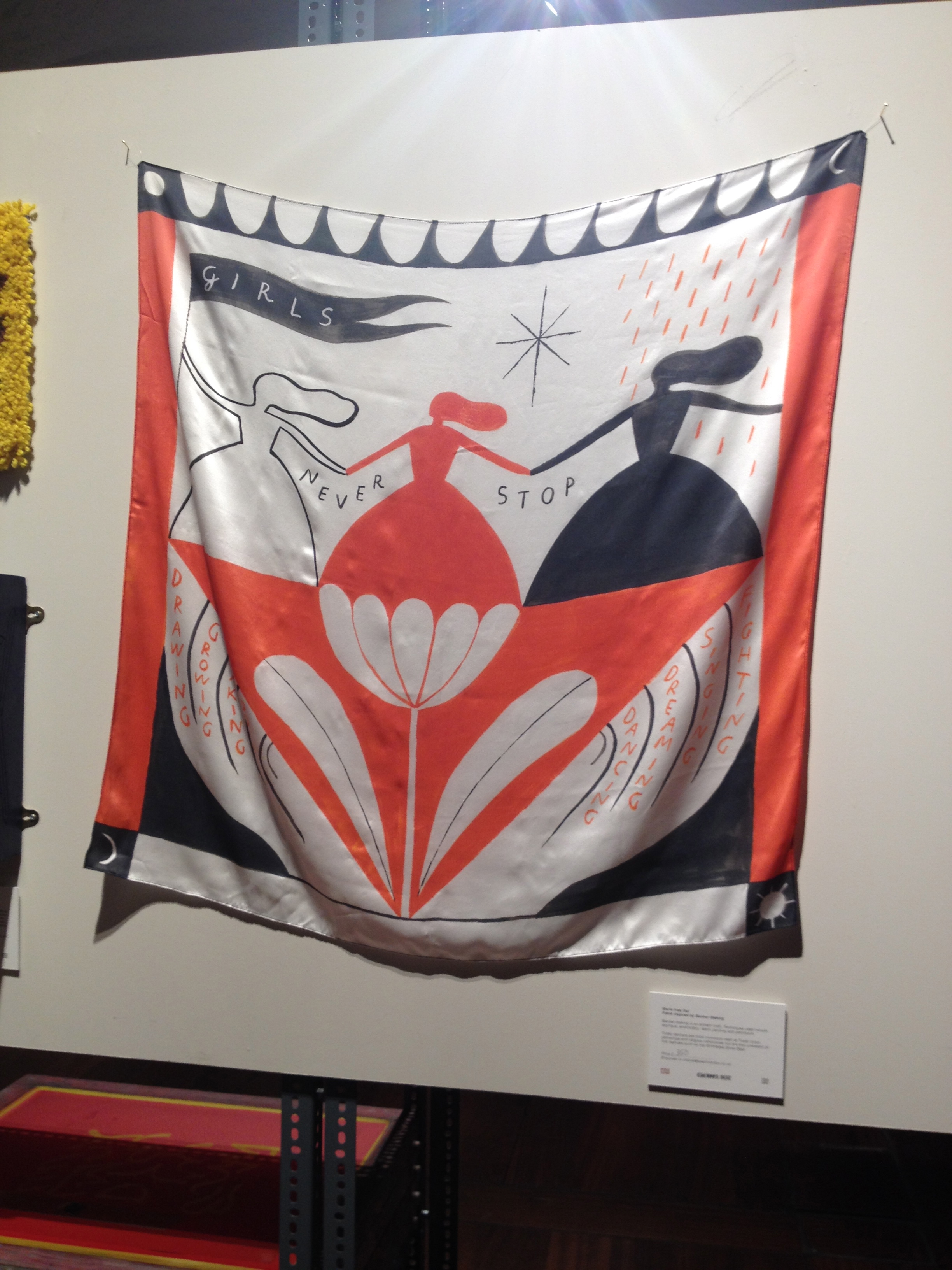

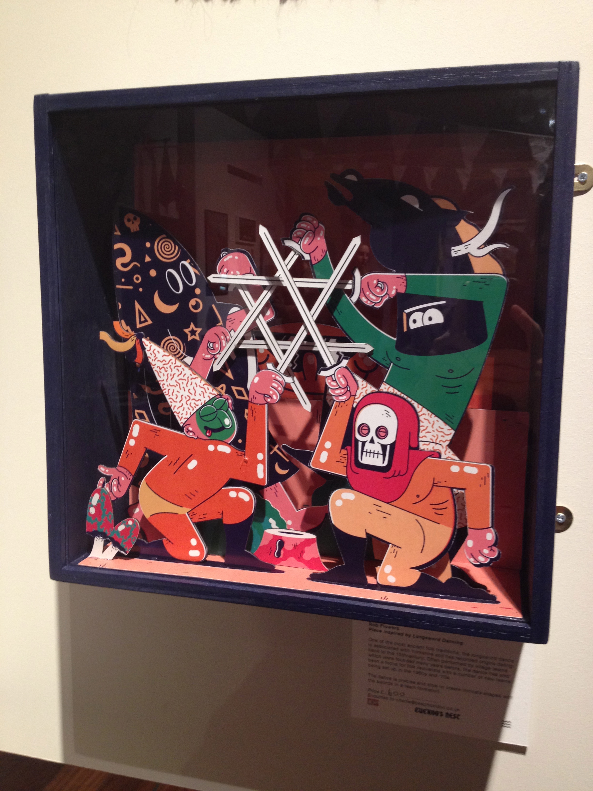
Above: selection of Pick Me Up content and stalls
I staggered round Pick Me Up looking for some piece to be a saviour or to provide some of the richness, beauty or emotional sting that Sony World Photos provides. There are some attractive pieces but they are overshadowed by drivel. Yes, comparison certainly stole my joy on this occasion. But if I am going to use the Emperor analogy I’d like to take it a bit further. Pick Me Up content is like Emperor Nero fiddling while Rome burns. I felt it was a lazy, vacuous, head-in-the-sand event with all eyes on cartoon-trendy, “swearing tweeness” and no thought for a globe out there that is on fire. I came out feeling like I had walked round a nursery open day.


Above: selection of Pick Me Up content and stalls, including Isabel and Helen’s prints and kinetic art, third from let
So, does art have to have a purpose? No. The Institutional Theory – that I do agree with – states that anything anyone says is art, therefore is art. It works on the basis of what is known as a “performative verb”. If, for example, I say “I promise” (performative verb!) I do promise via the act of saying so. It makes no difference I am not sincere or if I fail to carry out my promise. Promise I did through my spell-like utterance. The same applies to the performative “verb” art. We assume it is a noun. The word should have the verb version, I artise, you artise and so on. If someone “artises” an object as art it magically is art, whether they mean it or not, have any agendas and crucially, whether anyone else agrees or not. Mostly, though, people and especially the “institutions” of the theory – the galleries, critics, buyers – will agree and stage shows of urinals, of bricks on the floor and contemporary graphic arts. Duchamp, with his urinals and shovels, was trying to philosophically push and question the bounds of said art. Not sure that Pick Me Up content pushes any boundaries, except that of our tolerance to invisible suits.
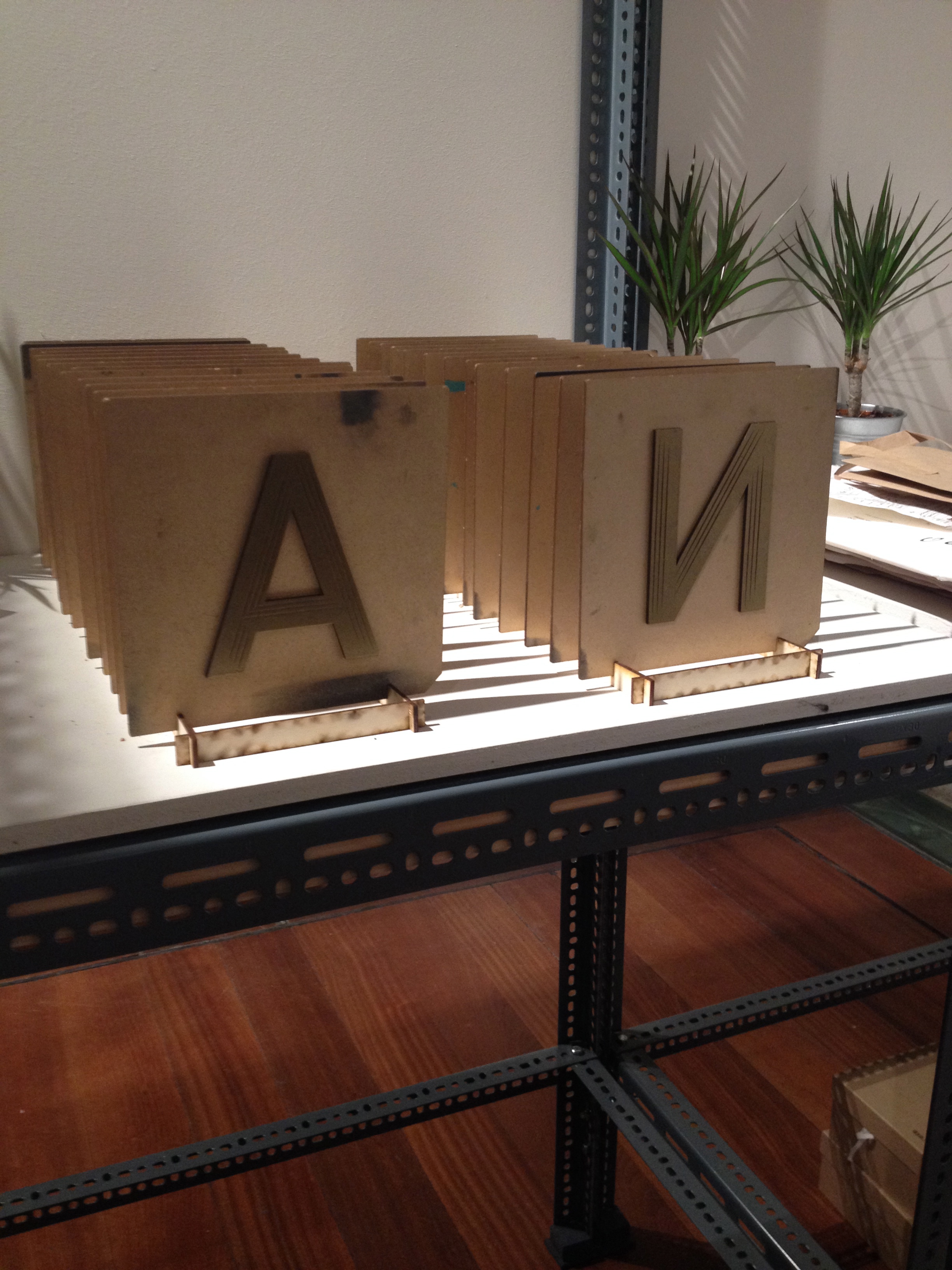
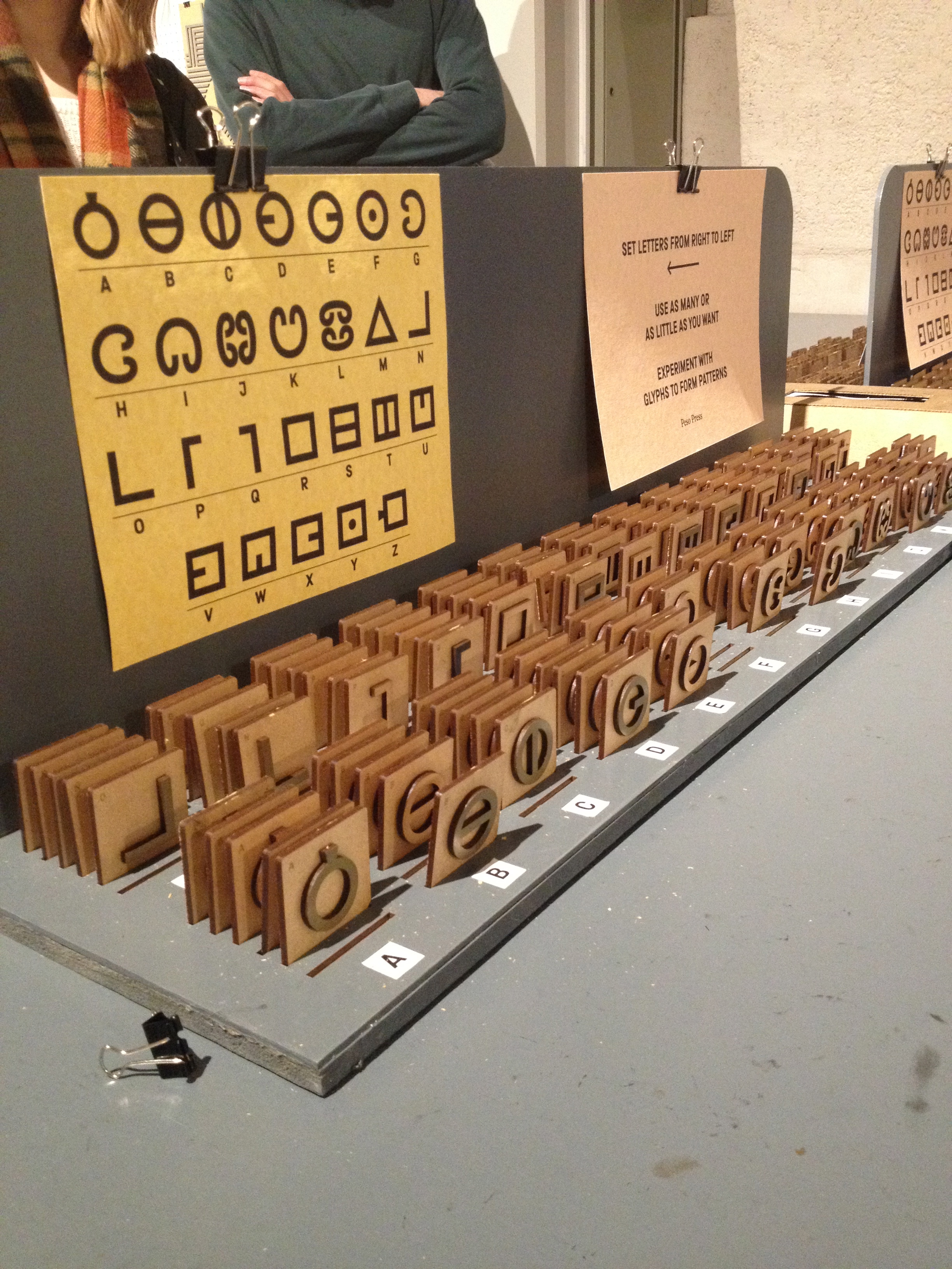

Above: selection of Pick Me Up content and stalls, including Marie Jacotey, third from left.
The question then remains, why am I so cheesed off with it? I accept that not all art or communication has to have a purpose, function or message. It does not have to be worthy or thought-provoking to be art, especially graphic art. If I accept that it is art, it must mean that I am saying it is not good art. Marie Jacotey’s drawings, for example, look fine in a different context in a graphic novel or comic strip where they usually reside. They’d work as editorial images, conveying a friendly yet sinister style and mood. After all Quentin Blake’s illustrations are simplistic, so is the style of the Simpsons and even much Pop Art. Yet these still hold meaning and their styling suits and contributes to what they want to say. I don’t want to hurt anyone’s feelings, especially when they are having a good time. Maybe just having so much of the same kind of thing in one place does each contributor a disfavour. So much lightweight “fun” all together wears a bit thin. Everything looks like a funny greetings card or a piñata and nothing looks like a piece of activism or serious attempt to communicate anything that matters. It is the consistency of the shallowness that annoys.
Keep calm and carry on being vacuous
Truly, if you cannot not communicate, then what was communicated to me? One: don’t bother visiting again. Two: don’t advise graphics students to visit it – or at least warn them not to be Emperor’s cronies. Three: Suggest the artists in Pick Me Up see Sony World Photos and maybe, just maybe, one or two of them could make some graphic art that responds…Four: ask Pick Me Up and Somerset House to shift the focus of the show and include some more, er, serious (am I allowed to say that?) work? Then the entertaining (sic) graphic art might make an amusing counterpoint to things more solid and thus dilute the avalanche of candy floss.
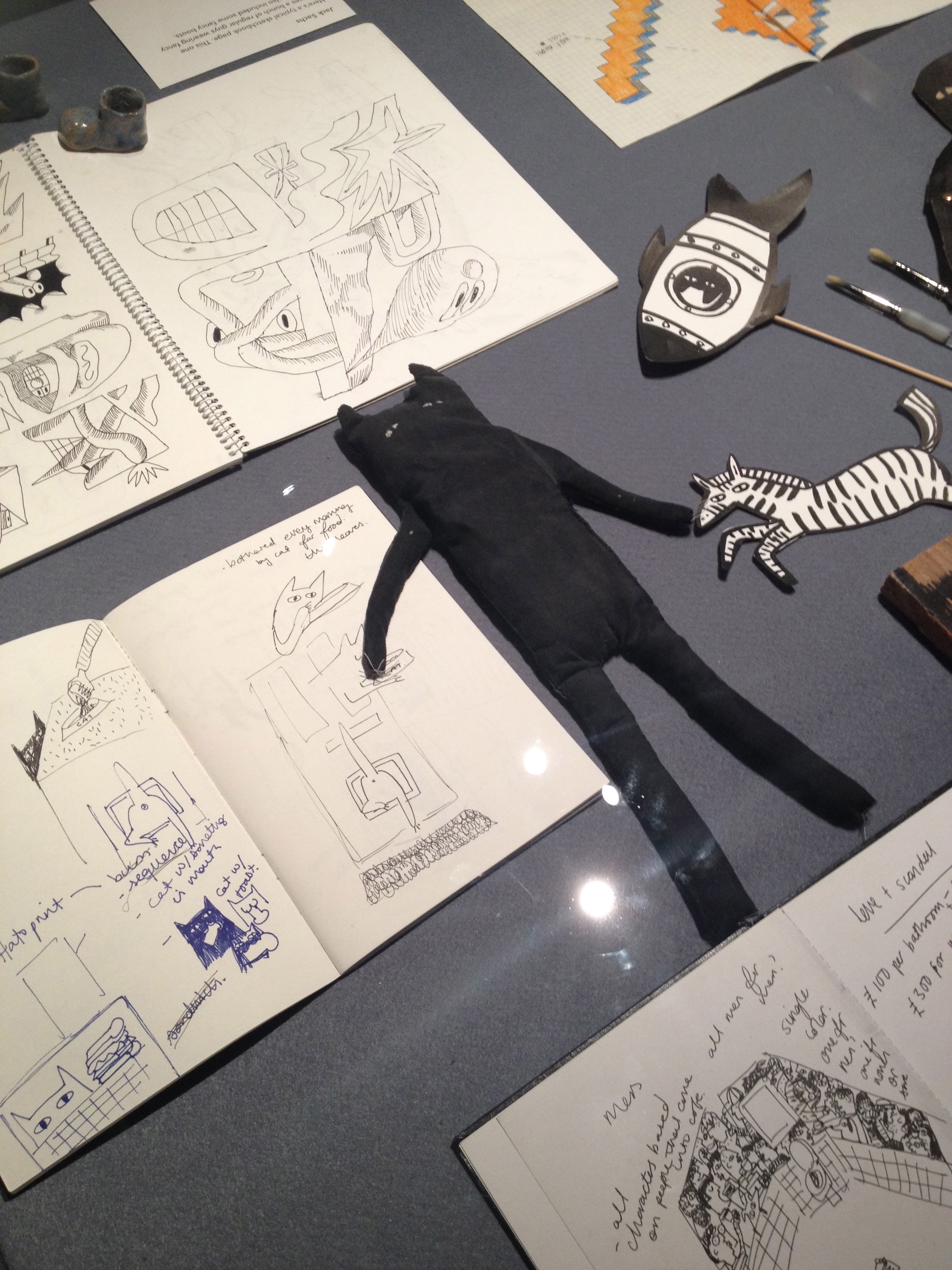


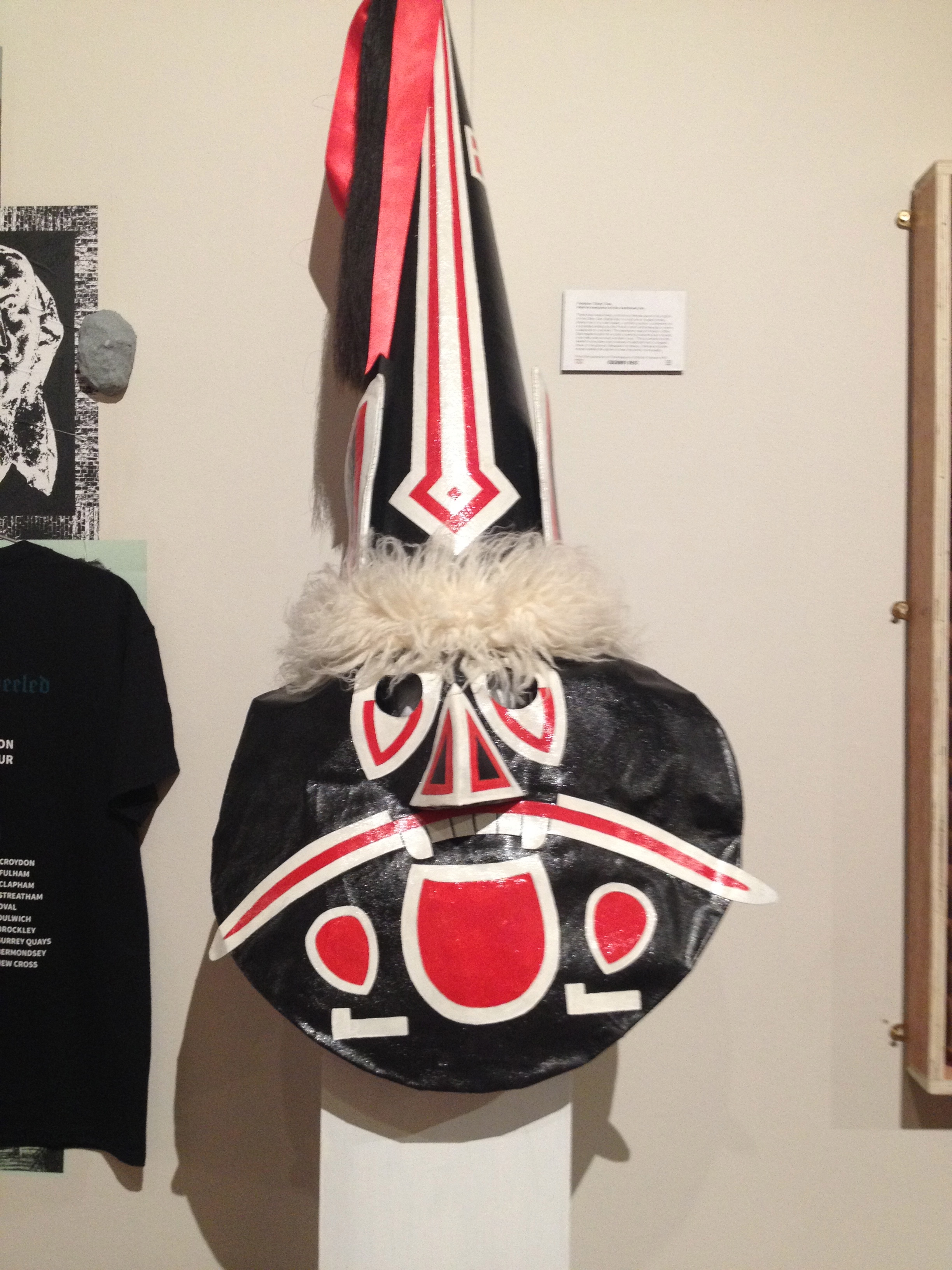
Above: A selection of Pick Me Up content, including sketchbooks of Alice Bowsher, far left, who likes “being daft and goofing off”, and Jack Sachs body part images, second from left.
Thank goodness for the section downstairs of the letterpress work of Alan Kitchen (A Life In Letterpress). Here was one typographic poster that questioned in his bold lettering style, the war in Iraq.
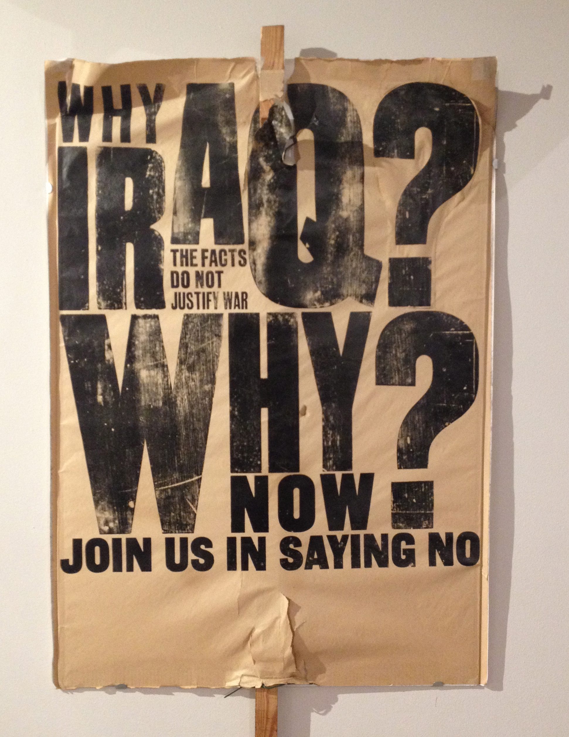

Above: Letterpress work from Alan Kitchen: A Life in Letterpress
As for the rest of Pick me Up, if communication is to help save us from the mess it has already made through political spin and advertising, this is not the place to look for it. My mistake. I thought the show communicated a strong message of “keep calm and carry on being vacuous”. Just what the powers that be want us to think. I guess I am just not liberal enough to accept art for art’s sake.
Sony World Photos is open until May 8th. Pick Me Up [including Alan Kitchen] is open until May 2nd. Both at Somerset House, London
Categories: Culture, Design, Graphic Design, Photography, Reviews, typography
