Originally I thought this post would simply be a visual showcase of the amazing typography at the Sustainable Cities exhibition at The Crystal in London’s Docklands. I’ve already posted about The Crystal’s rich opportunities to study design and awareness raising. But as I thought about what I would say (when writing a post “take an angle,” as I recommended to one of my students yesterday on the way home from said Crystal) I found myself relating the exhibition type to its purpose and, especially to its connotations and effects. My mind started making connections between The Crystal’s type and various other bits of interesting exhibition type that I have seen on my permanent and delightful quest for inspiration and information. So here are some observations of things I have noticed.
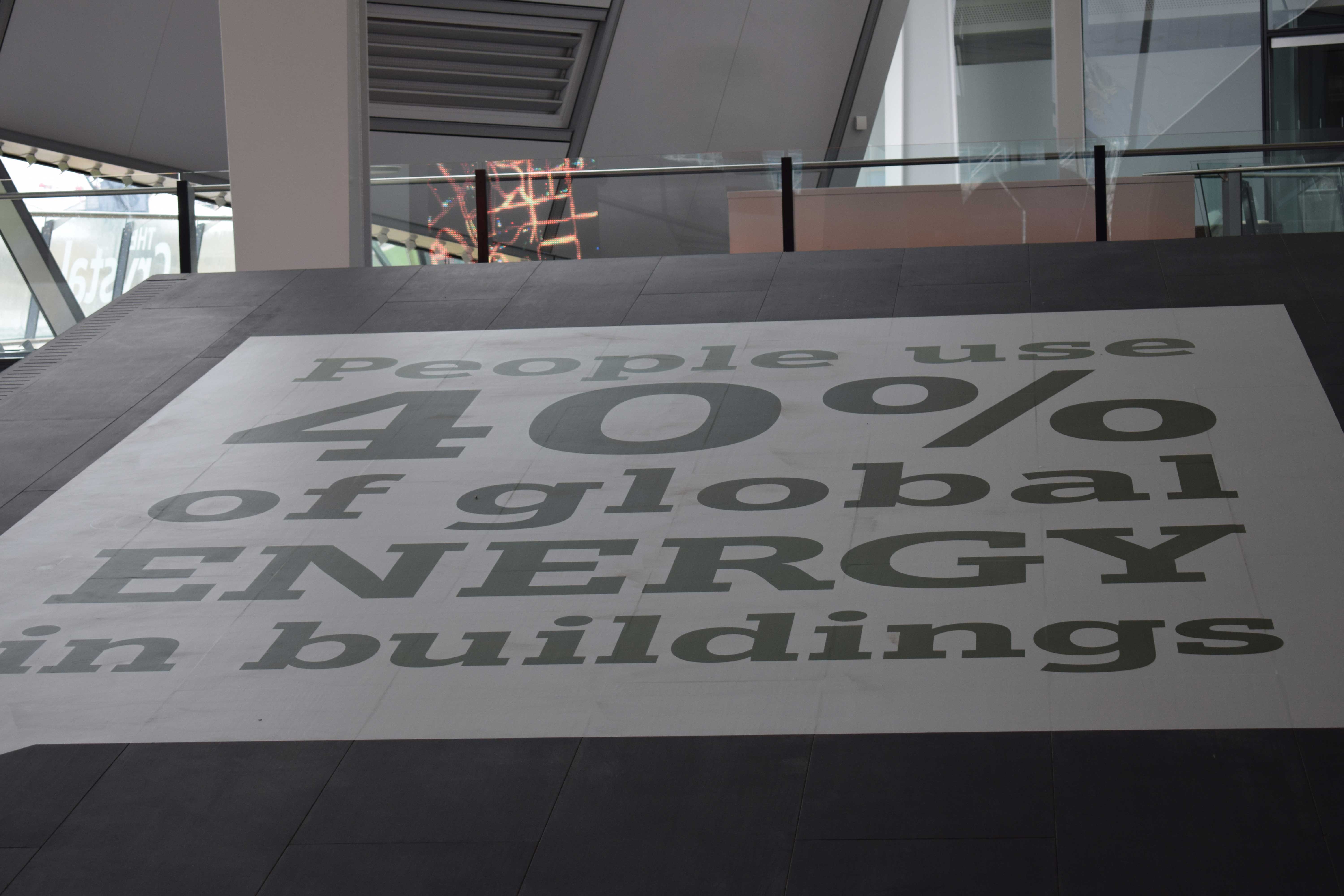
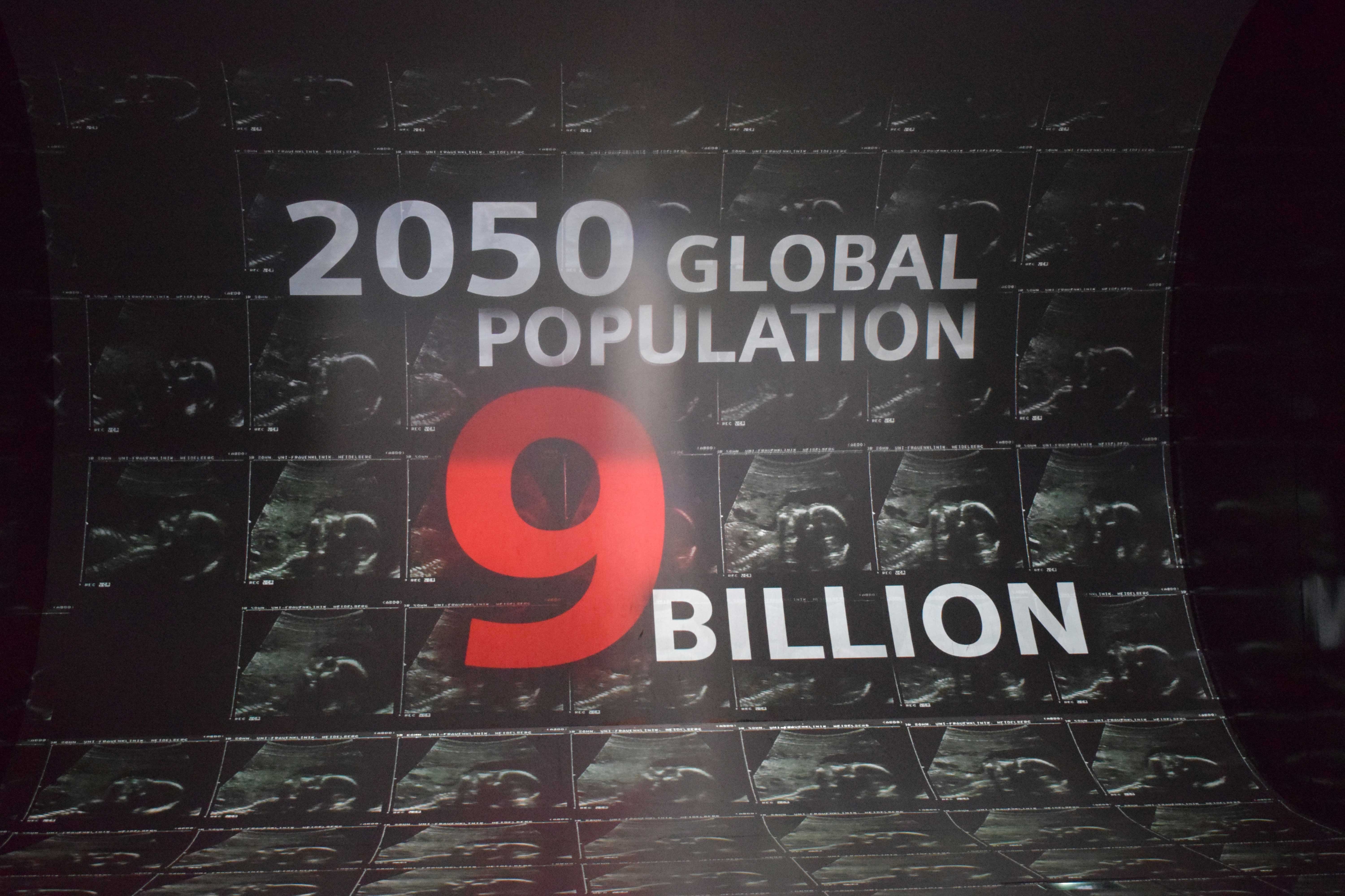
The range of letterforms, textures, lighting effects and moods of the typography at The Crystal is, as I have already said, rich. Typography geeks can wallow to their heart’s content and design educators like myself and colleagues find this a gift as a case study for our students. The designers have had to grapple with the design problem of turning what could be dry data and sometimes depressing facts about how and why cities need to be, and can be, sustainable, into something elegant and entertaining. So the interactive displays work on many of the senses. You can engage via digital screens and panels, peer through pouring water, pedal bikes to make electricity and watch a massive film screen of images and facts mesmerise you. How can the type hope to keep up with this myriad of neon pipes, metals, grills and electric BMWs?
The basic functions of exhibition typography are to direct you around the displays and inform you of what you are seeing. But that is too simplistic. The type also serves to add atmosphere and to give abstract suggestions about what you might be expected to feel. The type acts as a kind of behavioural guideline and is some cases could even anchor your reaction to a positive or negative one, according to what the exhibition is trying to tell you. The sustainable cities exhibition has to deal with many attitudes, including the sheer diversity of people who might be impacted by what happens in the cities or indeed in the exhibition; by the anxiety produced by climate change and other issues of urban living and rapid population expansion (amongst these the large proportion of the population who will be old as the proportion of the workforce shrinks). It could be overwhelming.
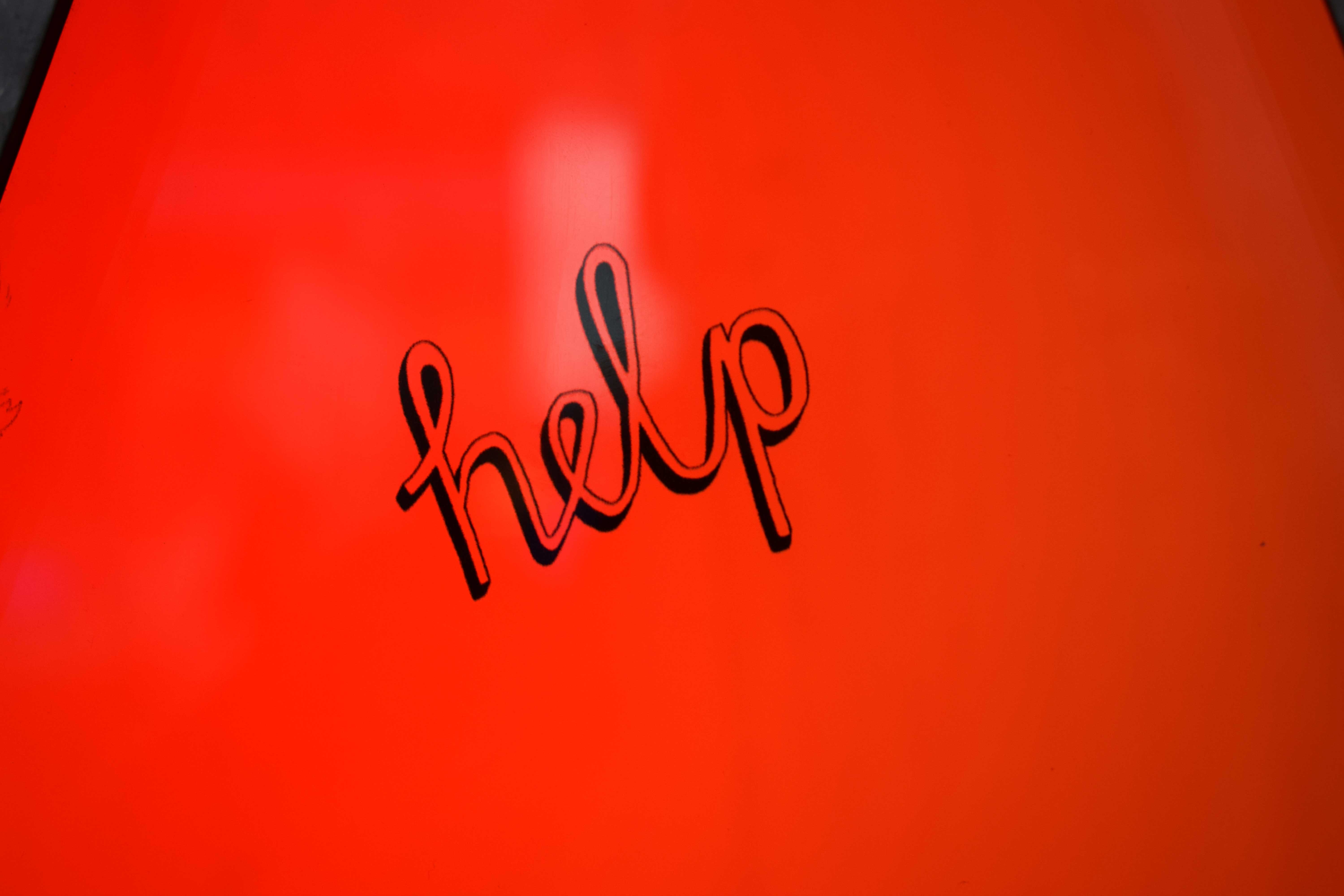
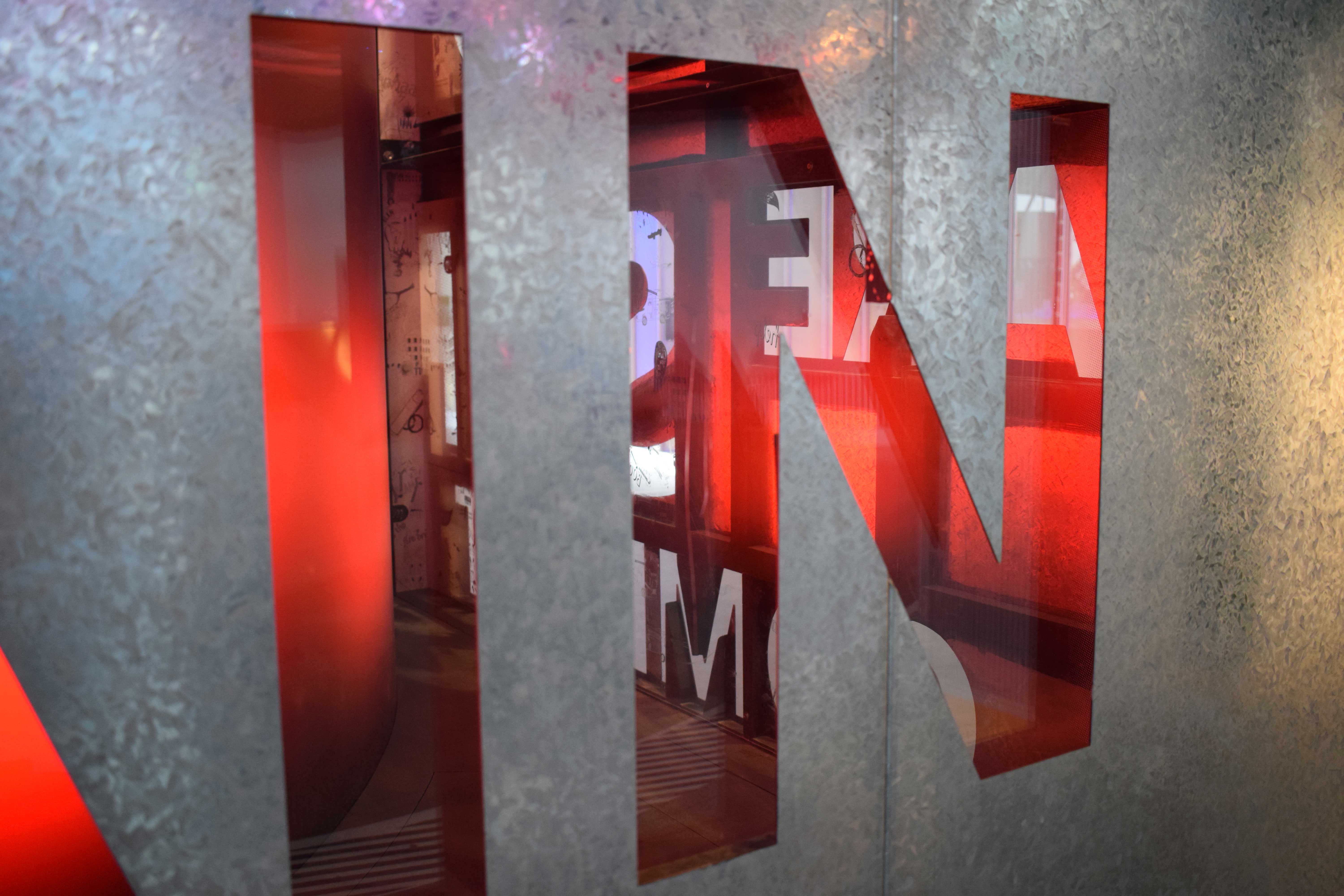
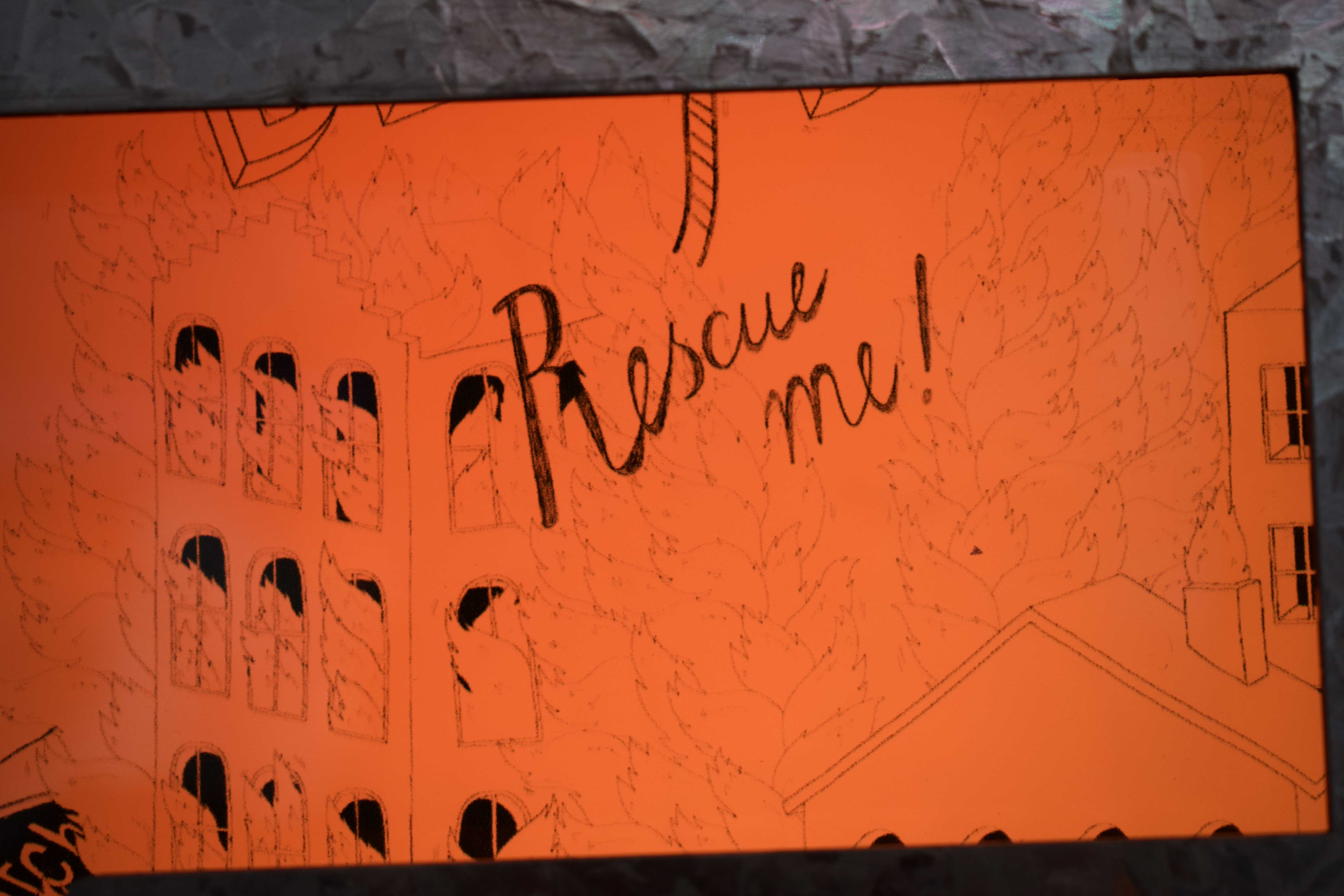
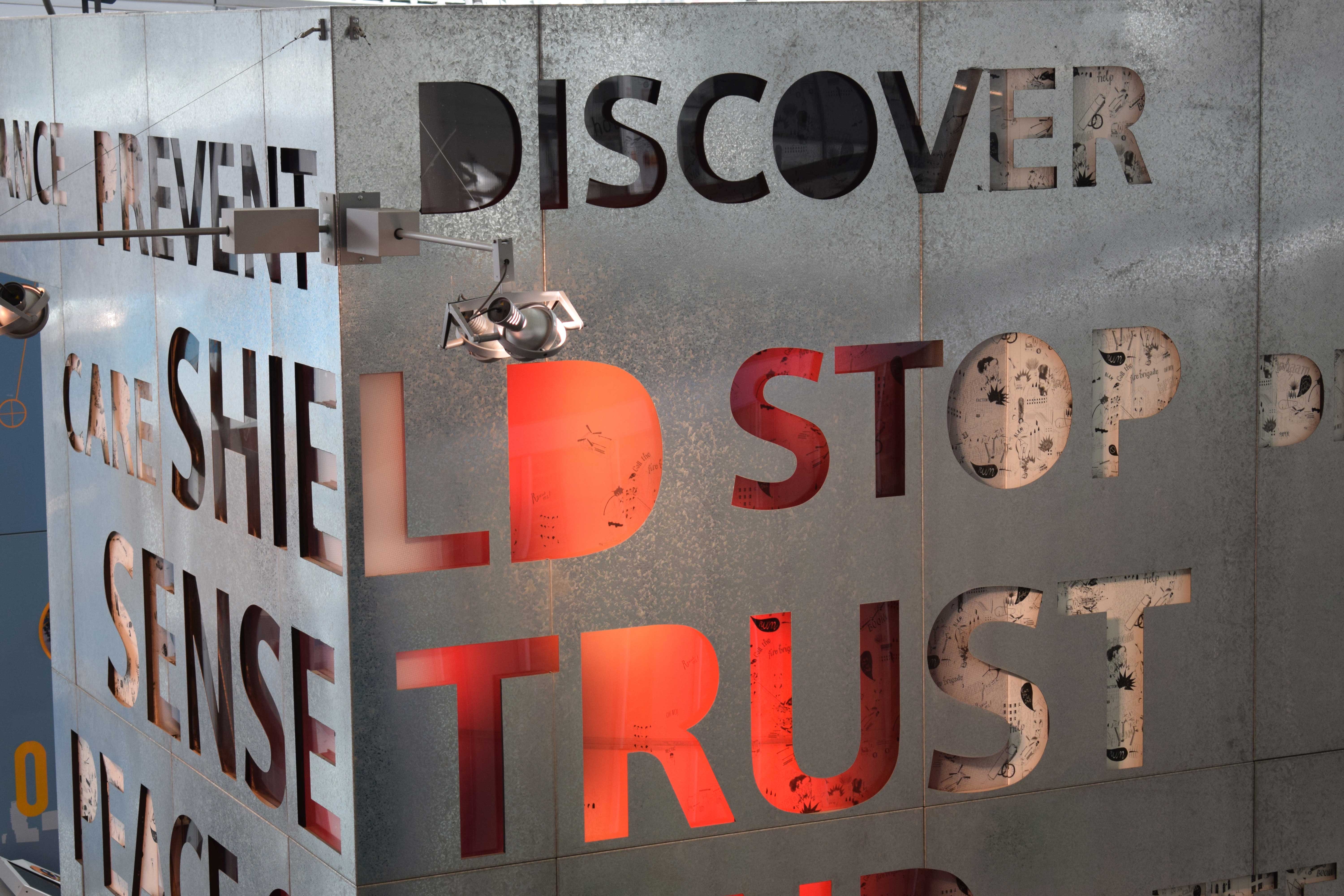
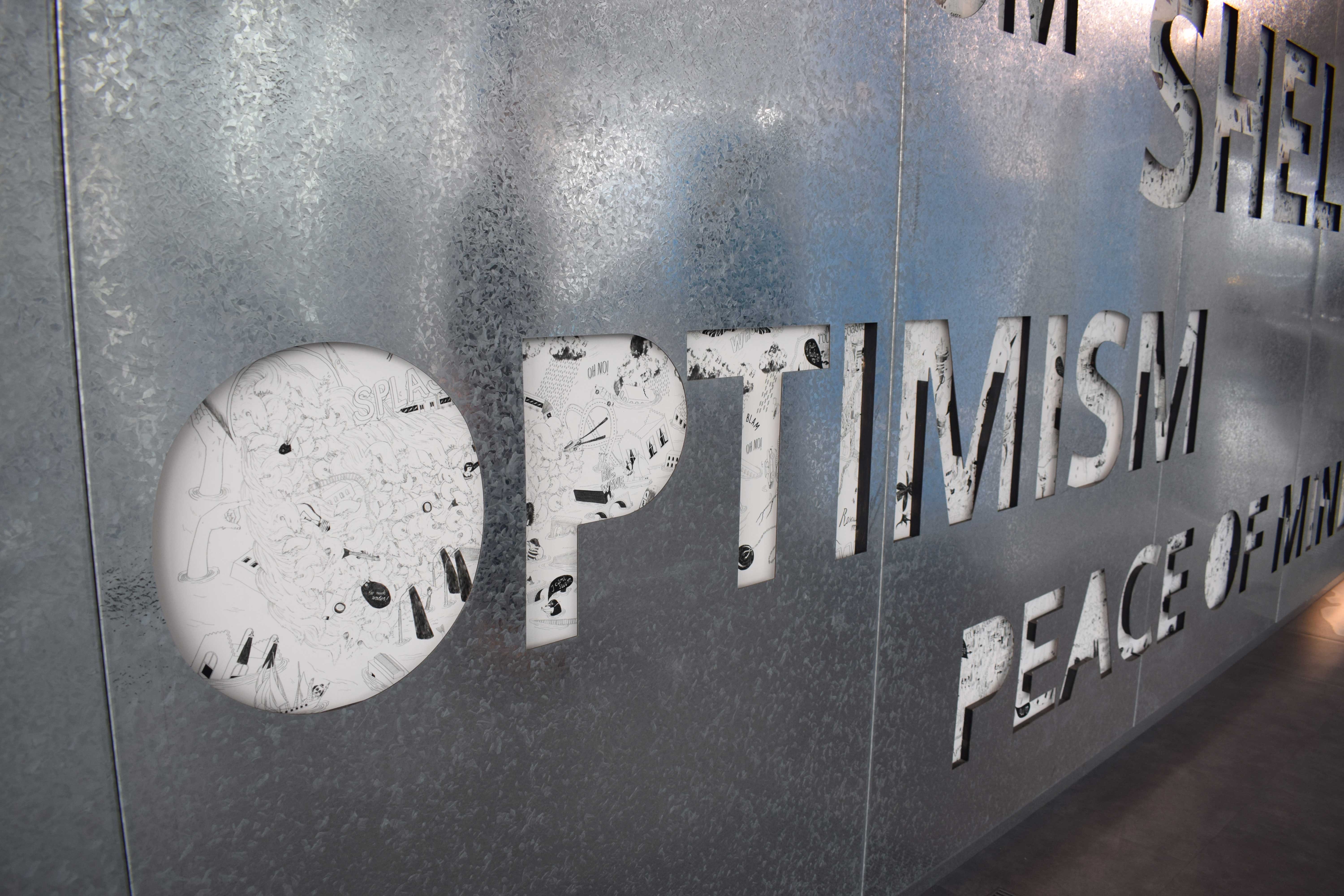
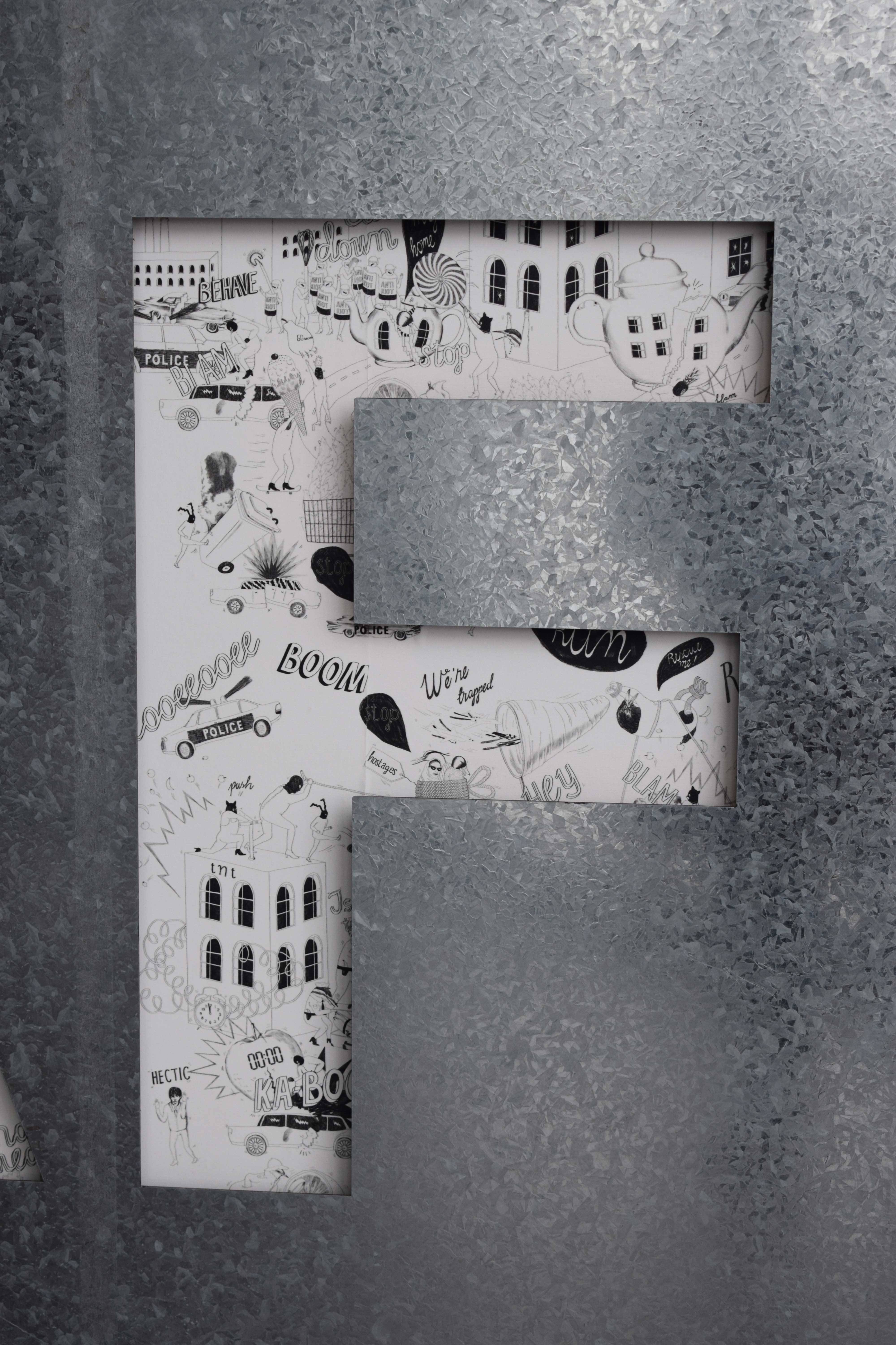
One example from The Crystal is the section on security and the ways that future cities may deal with this. This, like other exhibition type in general, could produce authoritarian kinds of dogmatic responses. But here we see a really well-thought out piece of typographic design. Throughout the whole exhibition the type often occurs as groups of one-off words that act as little triggers to your own connotations; are they questions (to help you engage) or suggestions (to give you hope and ideas)? In one section the aluminium walls are punched through with large cut out counter-form letters. The holes made are filled from behind with an illustrated elements that include line drawing cartoons and hand rendered phrases. The contrast of the metallic, glaringly bright wall that might represent authority or, at least, structure and stability, is offset by the cheerful and friendly human touches of the illustrated parts. In some places you can see through the counter-form letters to lighting that appears to be a fire. Handwritten yells for help and rescue also appear at the letter shaped holes. Here security is seen as a community effort to protect each other. The visitor can recognise that they might be in a fire and need help as an incident more likely and easy to deal with than the thought of massive flooding or water terrorism, for instance. In this example, the type itself becomes an integral piece of the overall display and is constantly giving you messages overtly and subconsciously. Who is not enamoured of the burning red TRUST or turns away feeling a little relieved?
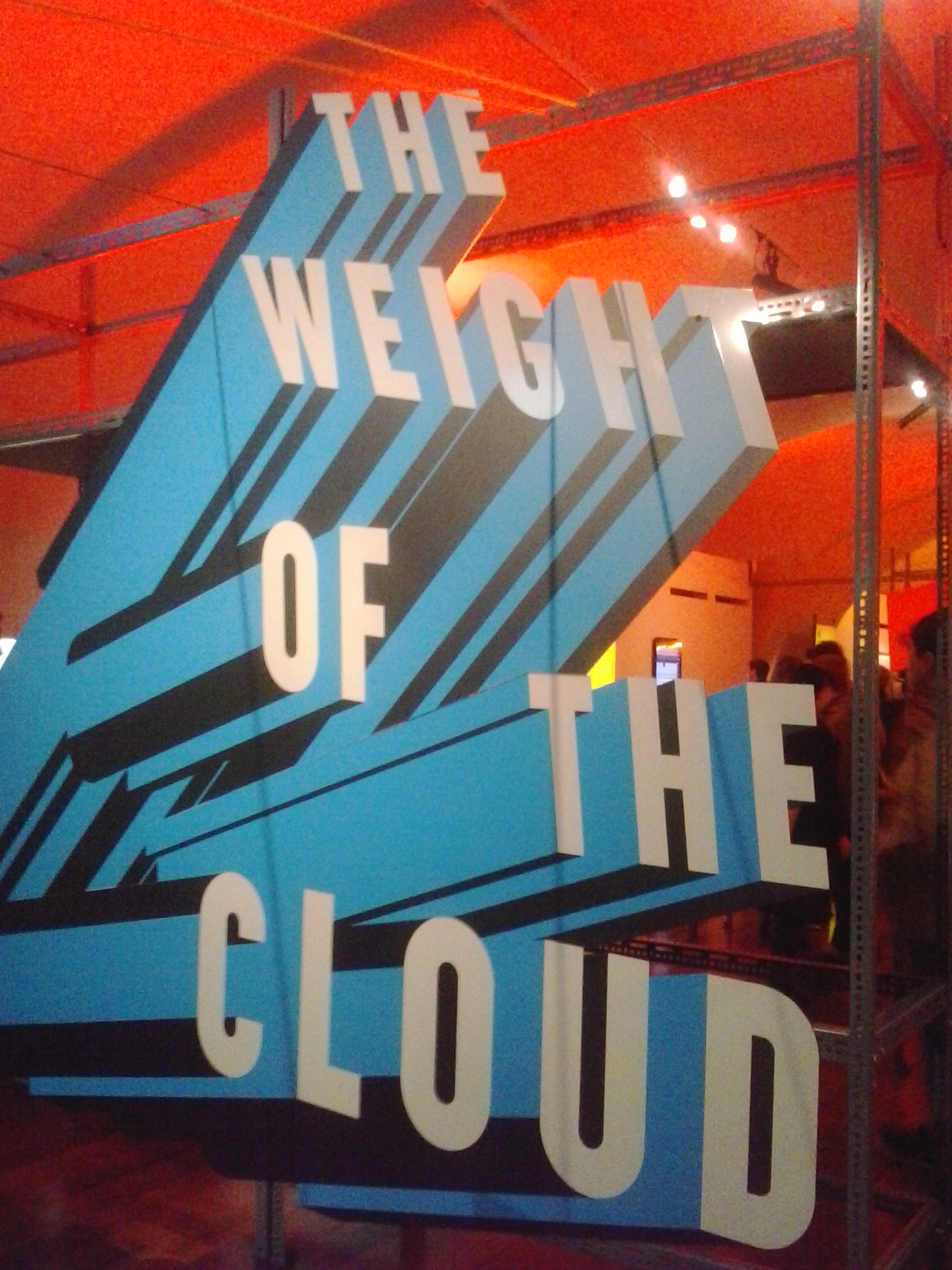
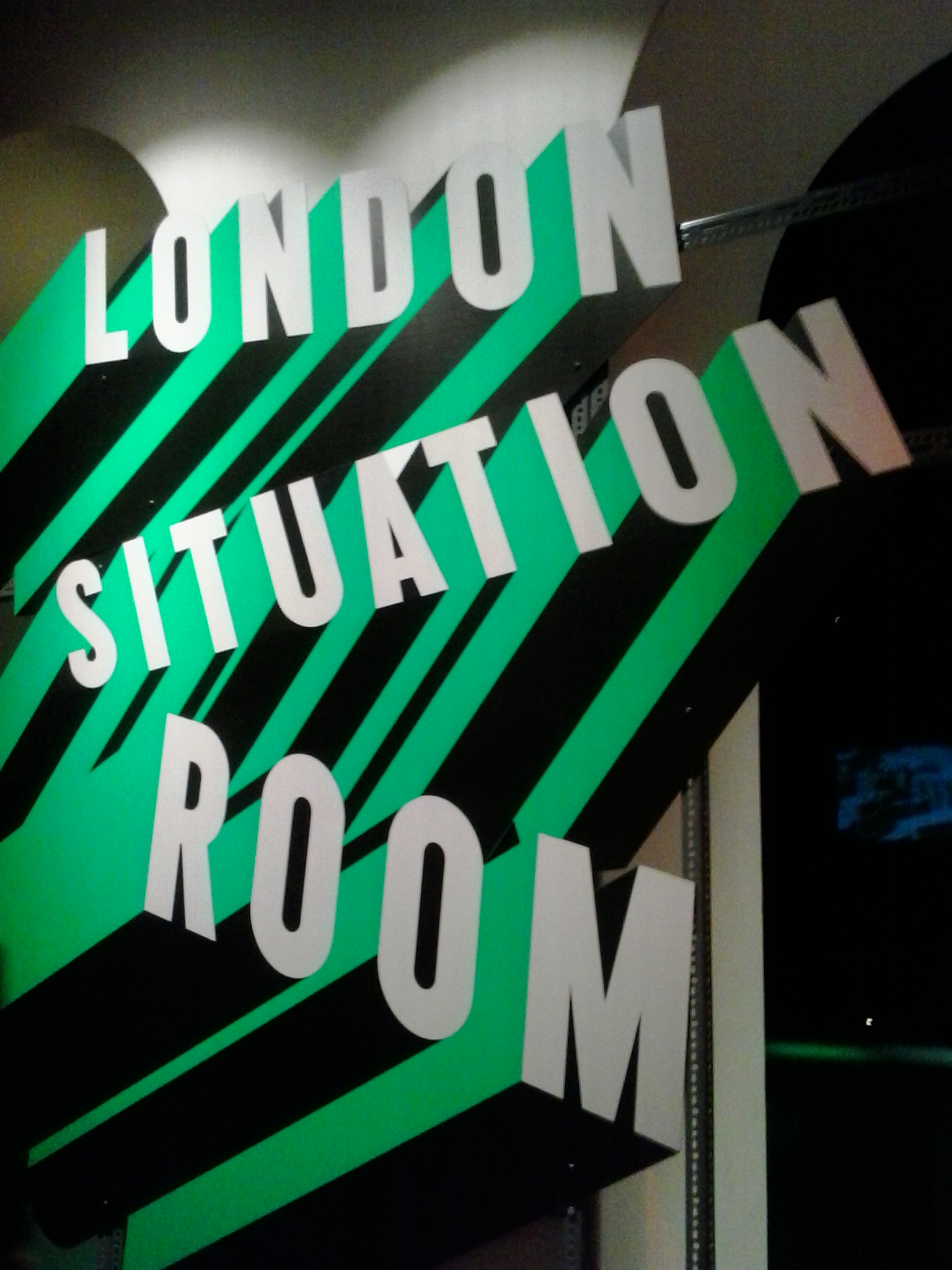
The recent (2016) Big Bang Data exhibition at Somerset House also demonstrated how designers had overcome the design problem of making some potentially dry and even boring topics exciting and interesting. Moreover, the topic of data often discusses things that are immaterial and invisible and, like sustainability, can even be anxiety producing, in this case because of its connections to surveillance. The exhibition graphics were designed by Morag Myerscough who created large scale, dynamic, comic book superhero style type that whooshes through space as if it is three dimensional. The odd angles of these type explosions suggests the chaotic nature of “the cloud” of data. These graphics separated out the subject matter spaces, creating an approachable, slightly tongue in cheek cheerfulness that it was hoped would appeal to all ages.


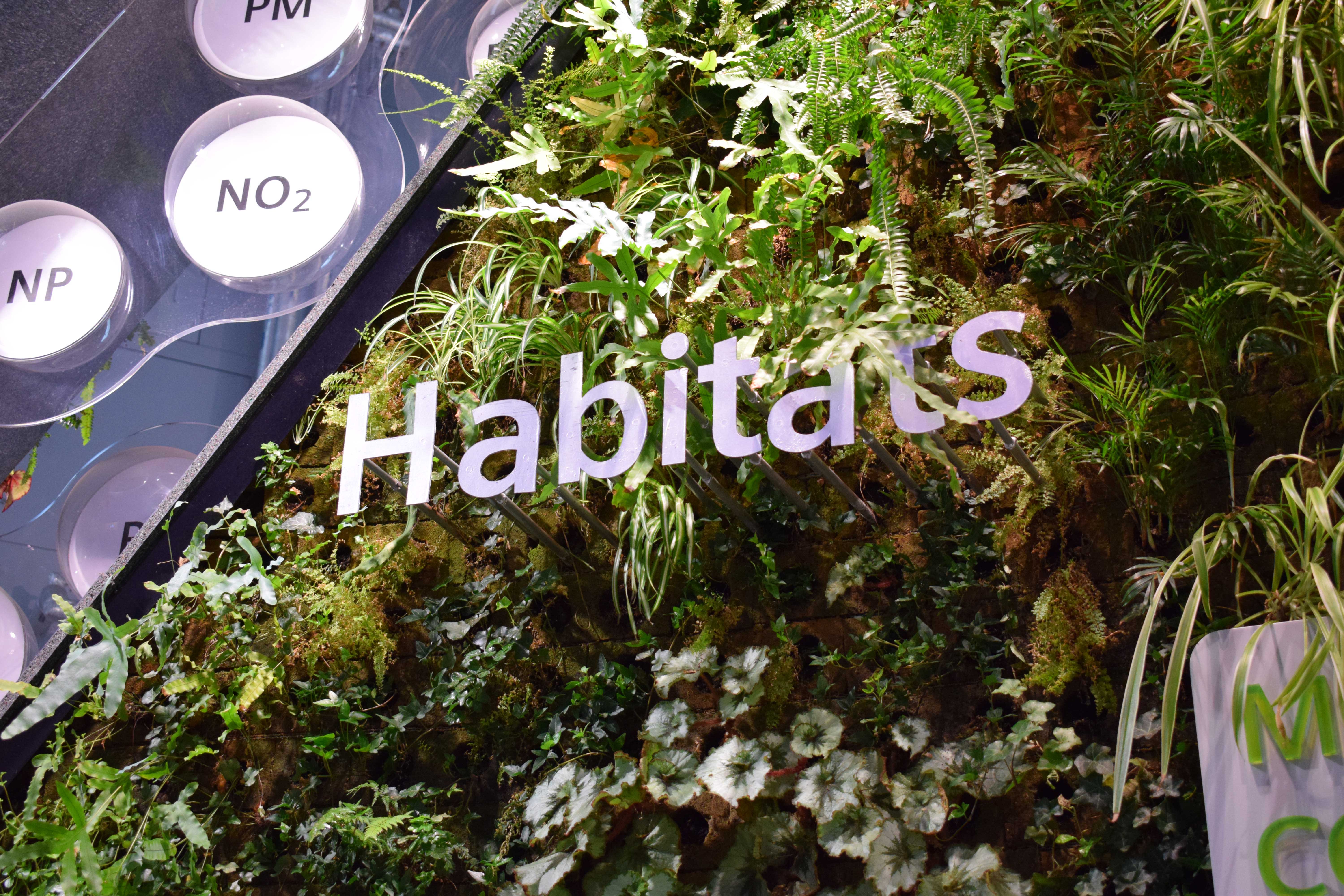
Back at The Crystal another example of type helping to make a topic approachable is the set of words and chemical element “bubbles” that emerge as if growing from a large display of vegetation. The juxtaposition of the clean and simple sans serif, lower case type with the organic growth and perhaps potential for chaos of the plants makes an unusual contrast. Having the plants the first place gives an air of calm and comfort. Their effect is to appear lush in relation to the many sweeping pipes and metal areas of the building’s space. Here again the words join together to give you connotations of plenty and natural purposes; “resource”, “habitat” and “biodiversity” amongst them. Even the fearful word “emissions” seems offset by the oxygen producing greenery.

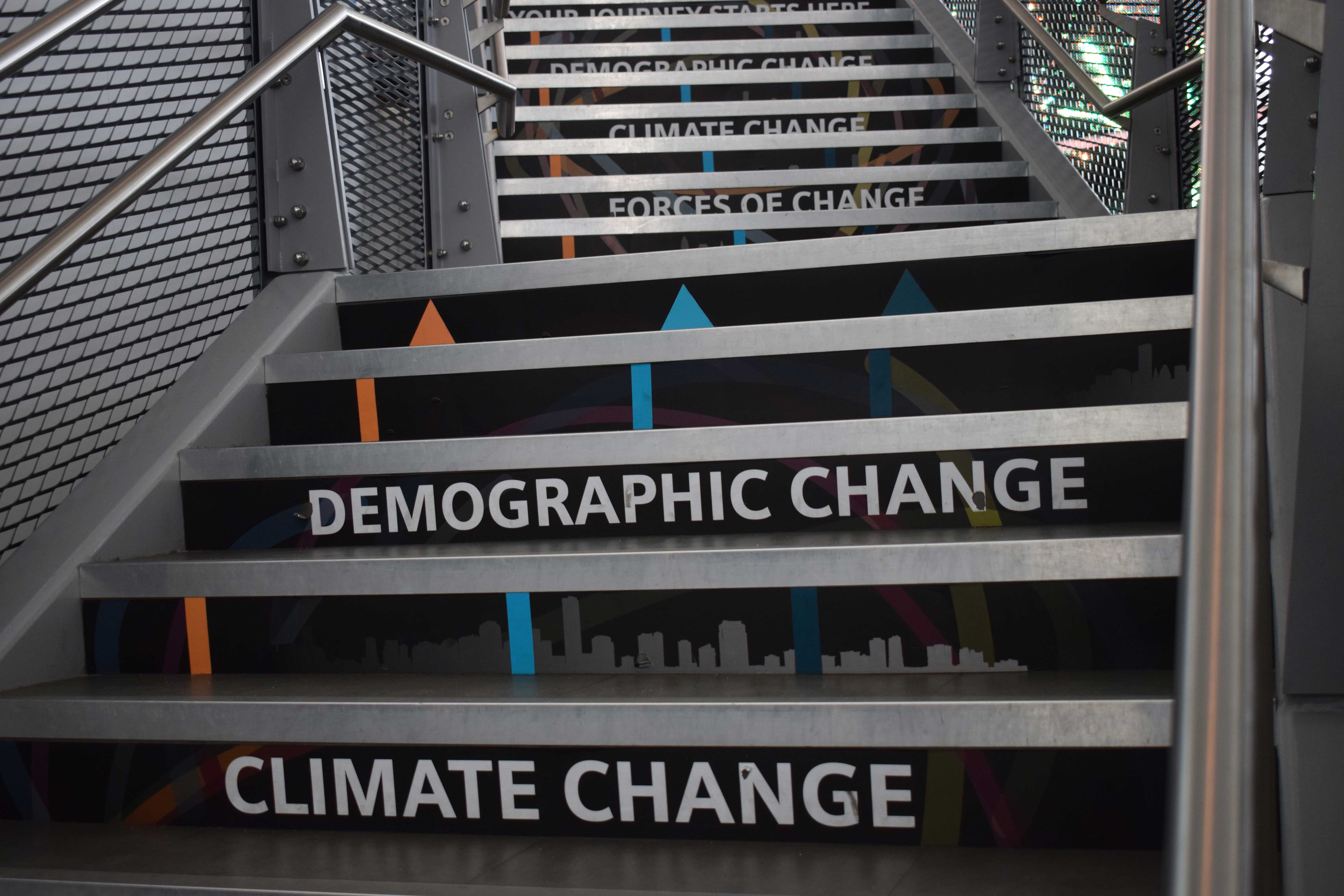
There are, of course, many examples of what can be termed “invisible type” amongst all of the attention-grabbing display type divas. By invisible type I mean the kind that just quietly gives you its message as conveyed in the words, rather than trying to make a scene with its dynamism. This kind of “plain” type is not really any less clever in carrying abstract meanings (especially of things like its “cleanliness” or ability to let the message breathe in space, or its power to look old fashioned or ultra-modern, authoritative or friendly). But this is the kind of type that just gives you lots of information and is used to direct you into the cinema or around the interactive digital displays. Sometimes, as in the case of the electrification of cars, the type works simply within a pair of colours and shapes.

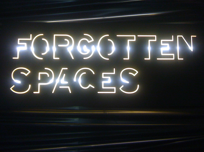
Yet there is also a lot of type that appears in lights at The Crystal too. They love their orange and pale blue complementary contrasts and much of the type is in lit up orange lettering, attractively picking up its hue from other parts of the display. There is something I personally like about type that is lit up. It reminds me of West End shows and glamour, or of cosy winter evenings, or of magical, treasured things revealed out of the darkness by a focussed light beam. Type made of lights is indeed theatrical but also retains connotations of value, both in experience and monetary worth. The Digital Crystal (more crystals?) jewellery exhibition at the Design Museum in 2012 was a showcase for Swarovski and featured a flashing sign. While the R.I.B.A. Forgotten Spaces display at Somerset House (2013) featured regeneration projects in its very spooky basement. The neon type for this, in combination with the site of the show and the plentiful use of black plastic in the type background surfaces, also had connotations of the revelation of the furtive and secretive, which married well with the idea of a competition to take ignored, broken down or disused place and give them new life in their communities.
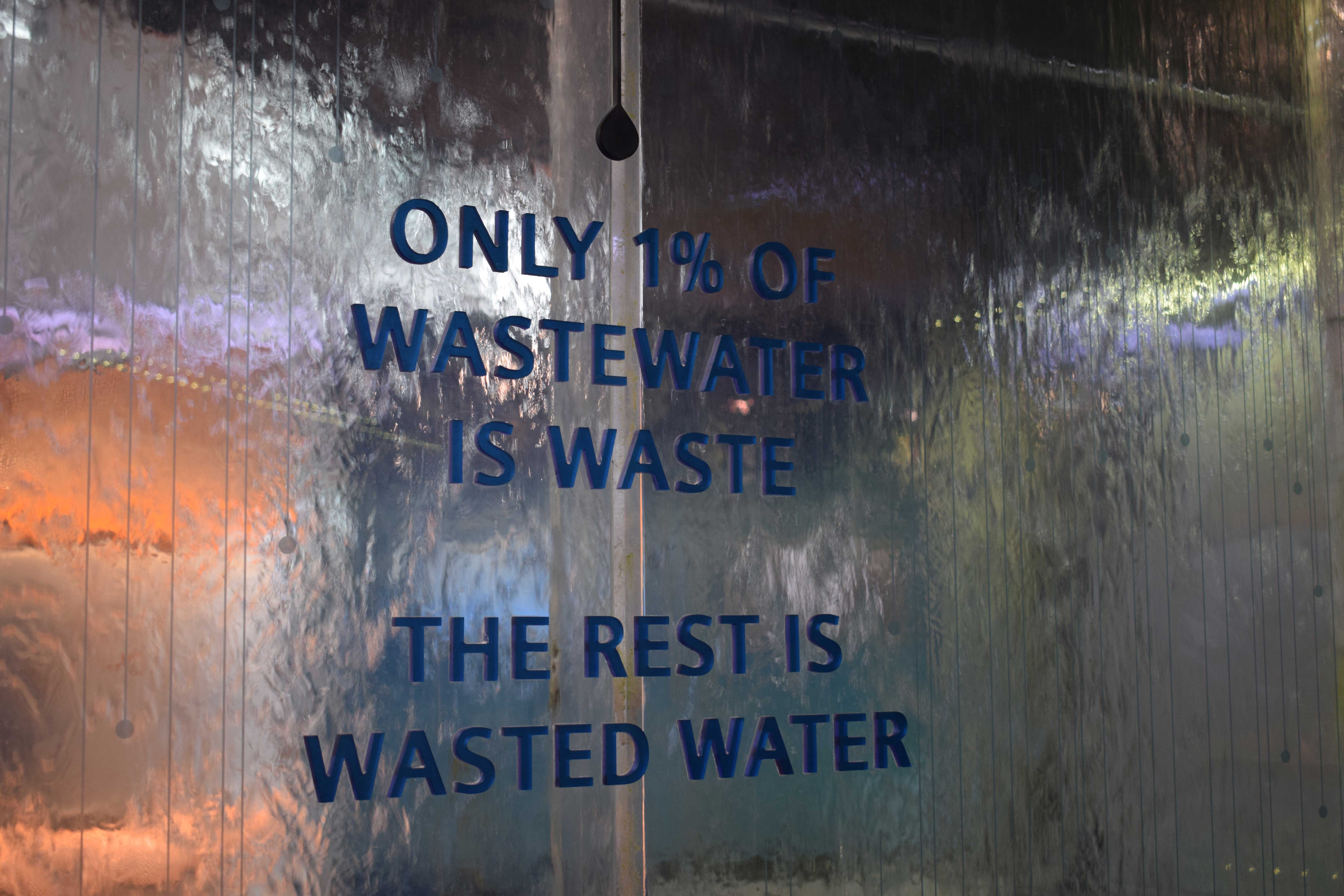
The Crystal’s type makes good use of texture, both as a background, but also as a feature of the type itself. Some of the type that is lit up looks almost gelatinous, evoking our imaginations of its tactile quality. The backgrounds of texture, as we have seen, range over metal, plant-life and a variety of shiny surface. But the highlight, perhaps, of this is the simple blue type that appears on a thin case of cascading water, so that the surface seems to move and we hear its babbling and gushing. In this way the combined experience of hearing, seeing and reading fixes itself very well in our minds. The topic here is that although water on the Earth is plentiful, only 1% is drinkable. The rushing away of that water behind the type, demonstrates very clearly how much passes in the short time that you read. The floor grills showing it flow away also underline the point of usage and waste. The type messages in The Crystal are embedded in the overall points the exhibition wants to make. All aspects work together to inform you.
One of the most powerful pieces of exhibition type that I have seen was the enormous, white M that greeted visitors to the V&A’s Modernism show a few years ago. In lower case, sans serif (of course) and set at a jaunty angle (of course) across the bright red wall, this single letter was a piece of type that stopped me in my tracks. It summed up the themes and moods of the exhibition and, though not one of the original, historical pieces of the exhibition, remains embedded in my memory as one of my main “take ways” from that enormous show. You can see an image of it at the website of its designers, Studio David Hillman.

And finally, a few more thumbnails of other interesting exhibition type.


All images of The Crystal, except:
Weight of the Cloud and London Situation Room – Big Bang Data (Somerset House)
Digital Crystal – Design Museum
Forgotten Spaces – Somerset House
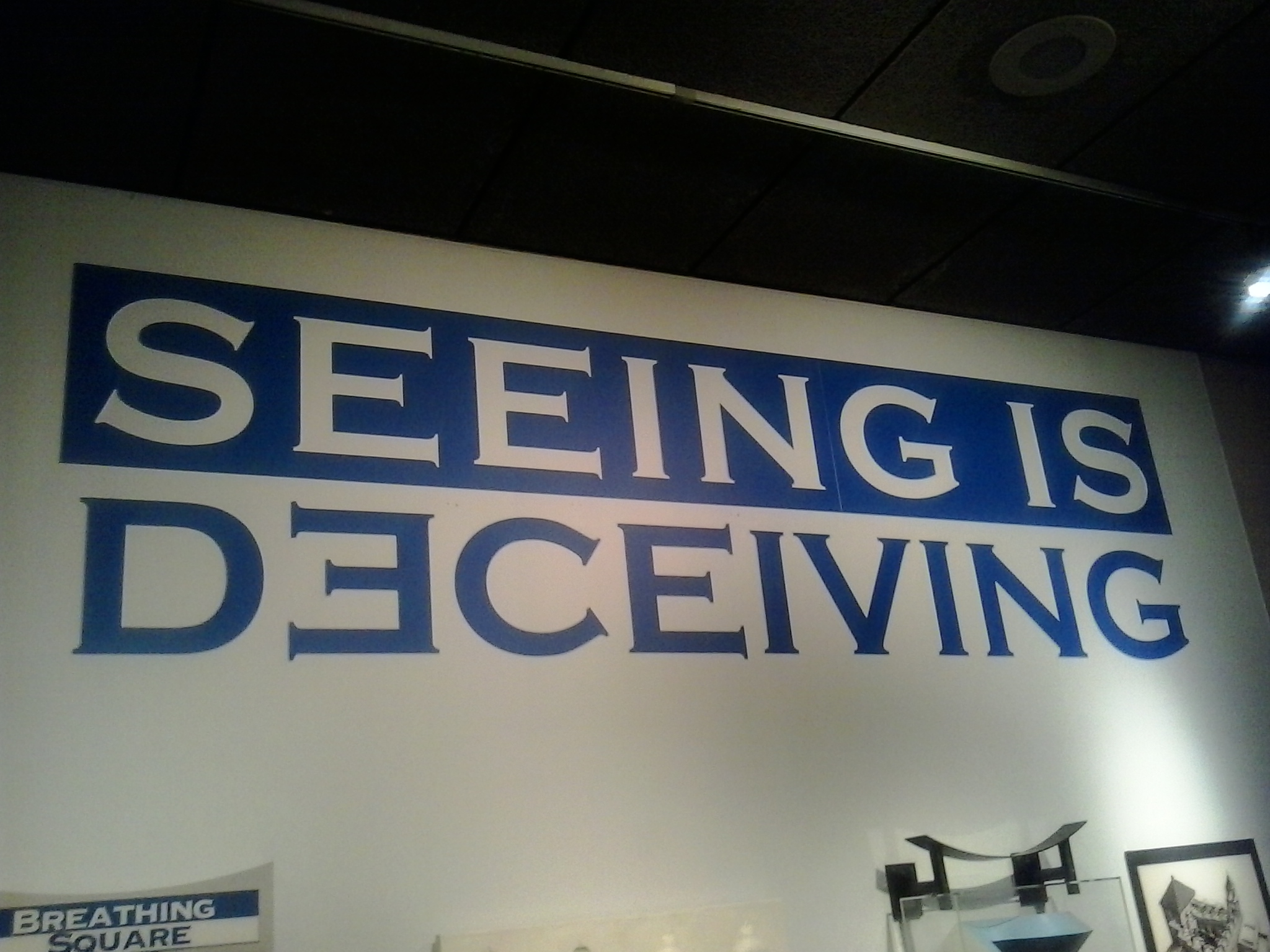
Seeing is Deceiving and Hall of Human Life – Museum of Science, Boston
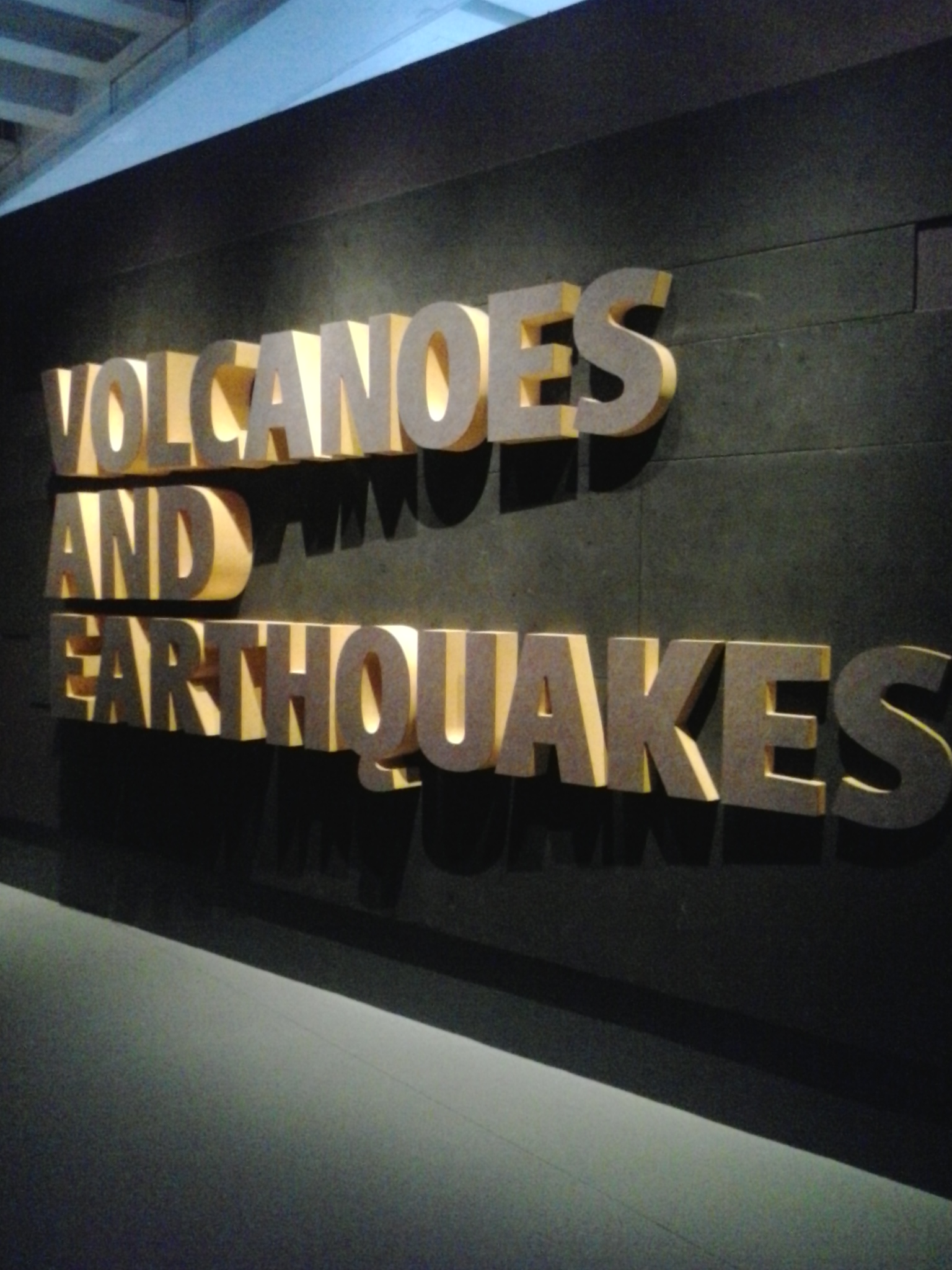
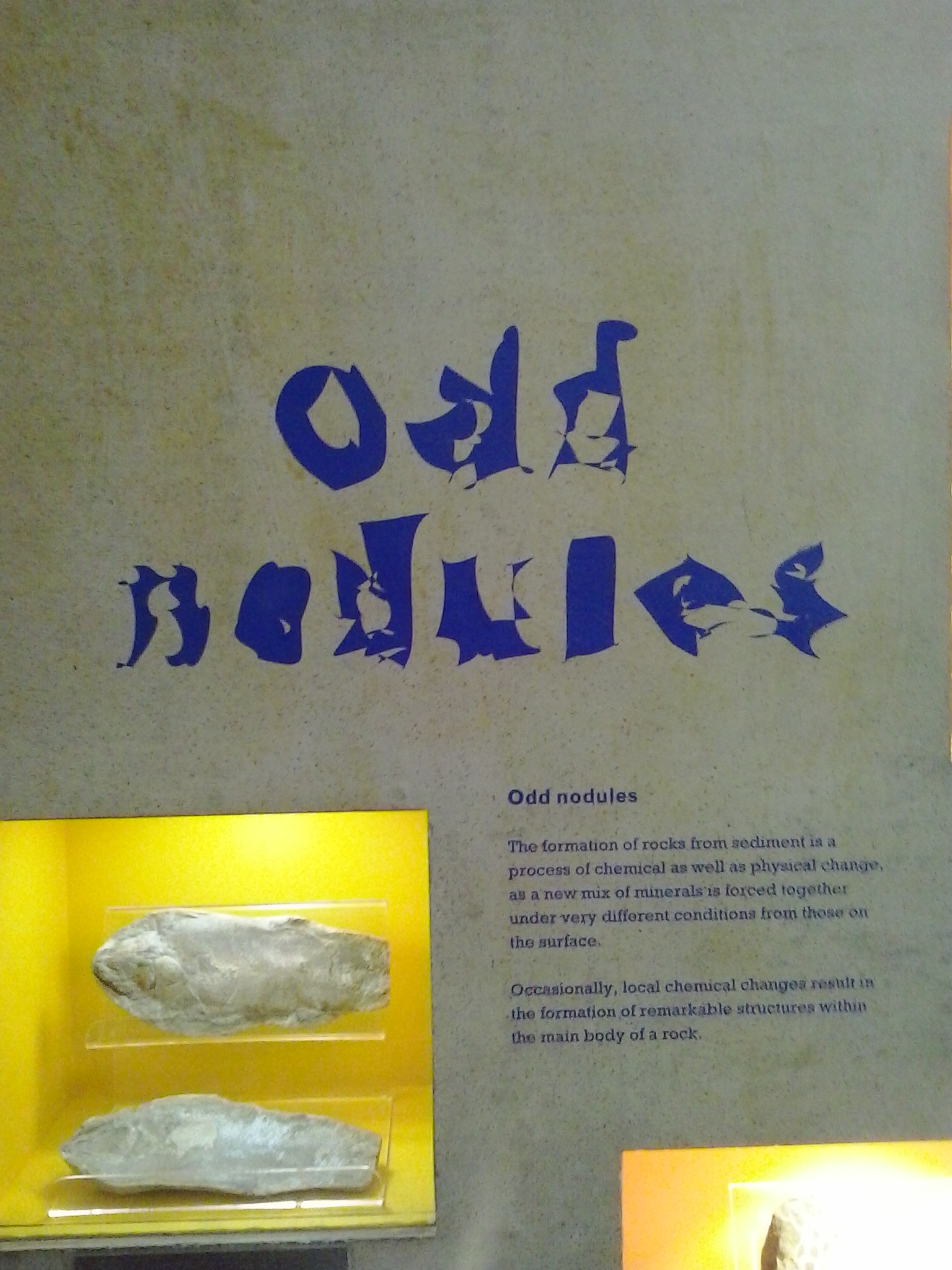
Volcanoes and Earthquakes and Odd Nodules – Natural History Museum, London
All photos by Sancha de Burca
Links:
The Crystal https://www.thecrystal.org/
Morag Myerscough discusses Big Bang Data designs http://www.itsnicethat.com/articles/morag-myerscough-somerset-house-big-bang-data
Categories: Design, Graphic Design, typography
