In the press release for Somerset House’s current Big Bang Data exhibition Jonathan Harris wonders whether governments and the others who control our lives have got so hot about “show me the data” that they have forgotten old fashioned wisdom. Where are the people, the emotions, and the consequences in all of this? So the show is both an old fashioned spectacle and deceiver in its enticing call to join in, interact and have fun; but it also serves as a warning that you are being watched, counted, listed and data-ised all of the time and that half of that time you do it yourself – for pleasure.
Yet the current (welcome) trend in design is user experience and indeed the ethical use of data for the common good. Recent visits to the Design Museum’s Designs of the Year exhibition confirm that designers are indeed creating things like apps to help people make analysis of data to enable them to be better ethical shoppers (Disclosed app), or to help new calves be born safely (Moo Call text alerts).

One of the most important aspects of data is, of course, its visualisation or lack of it. How can we understand it? We all know that data can lie, accidentally or deliberately. And often it just confuses. In art and literature there is what is called The Intentional Fallacy which states that the viewer/reader can never really know what the maker intended; it is a false belief to think that you can. Data, it could be argued, should have its own Intentional Fallacy warning label.
So seeing Ingo Günther’s World Processor art installation at Big Bang Data was fascinating and informative at the same time in that objects that looked at first like fun, lit up globes (which they are) in fact revealed data presented as clearly understandable information. Take for instance the globe about the current refugee situation; here red arrows are used to sweep across portions of the map showing the movement of real displaced people. Troubled areas show up instantly. And intriguingly, or perhaps obviously, the arrows show movement going both into and out of specific areas like cold air rushing in to replace hot air (ironically the recipe for a storm). The point is, seeing this in a context – on the planet – enables a much more comprehensible understanding of what is happening. Though, of course, the why is not there; just the signifying red swathes of pain, loss and oppression, like a morbid weather report.

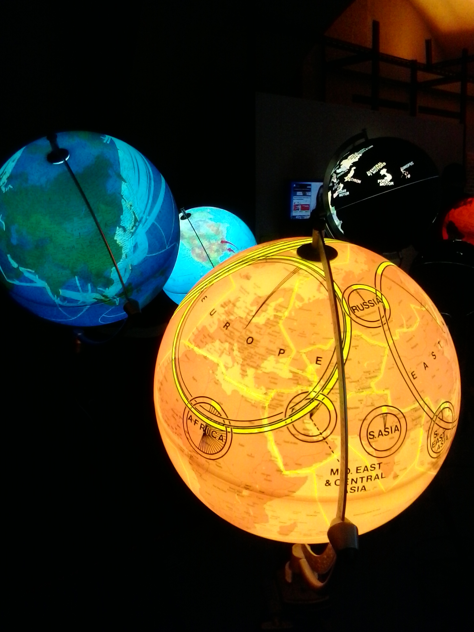
This use of metaphor is echoed in a large dome planetarium installation which shows the financial success of companies and corporations like stars and creatures moving about the night sky. They move in relation to their financial success and context. Their seeming independence is both fascinating and alarming and their appearance as self-directed beings makes them both cute and threatening at the same time. Perhaps we are all wary of financial institutions and activities these days so it may not be surprising that the jittering shapes move like microbes.
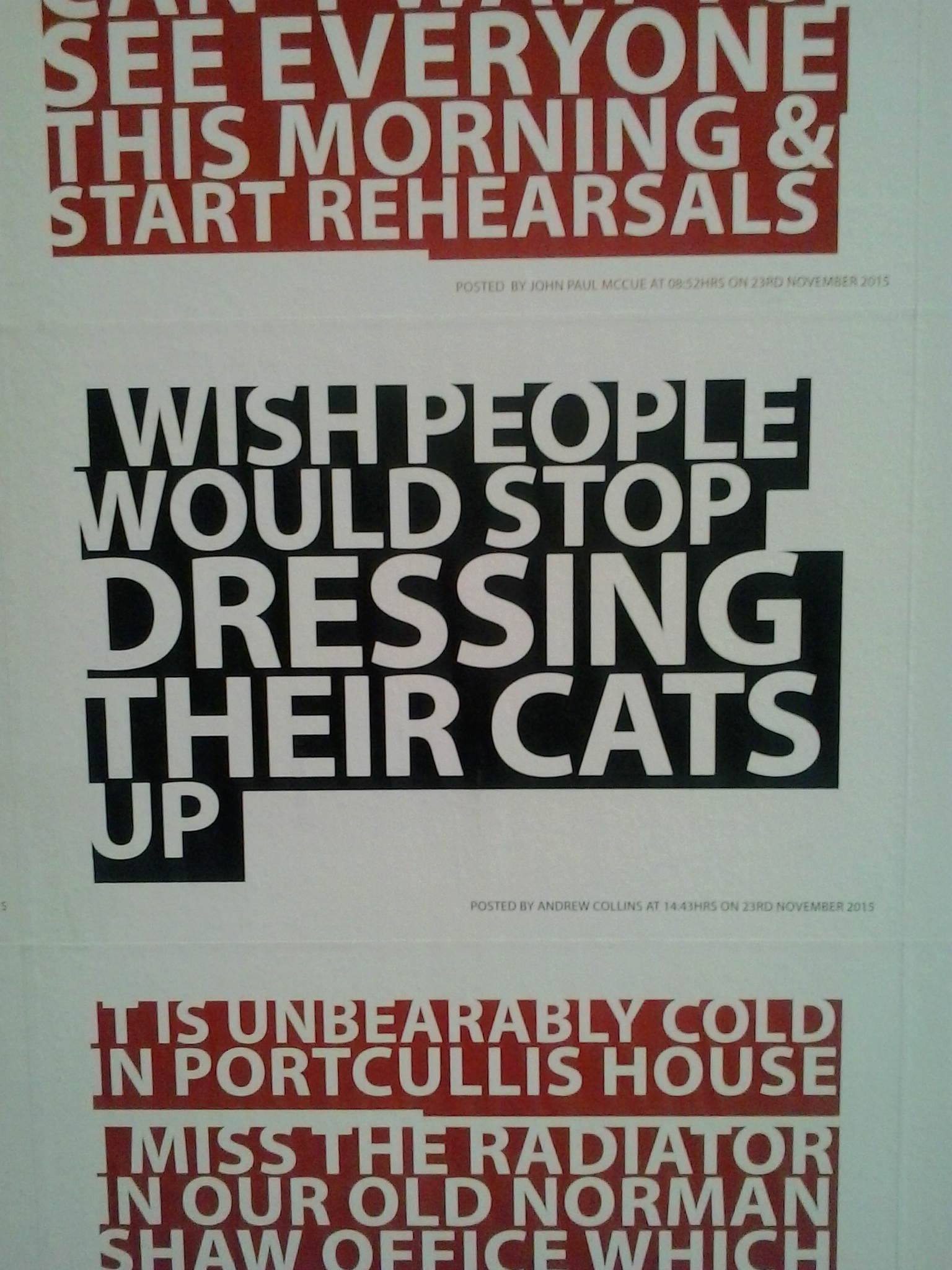
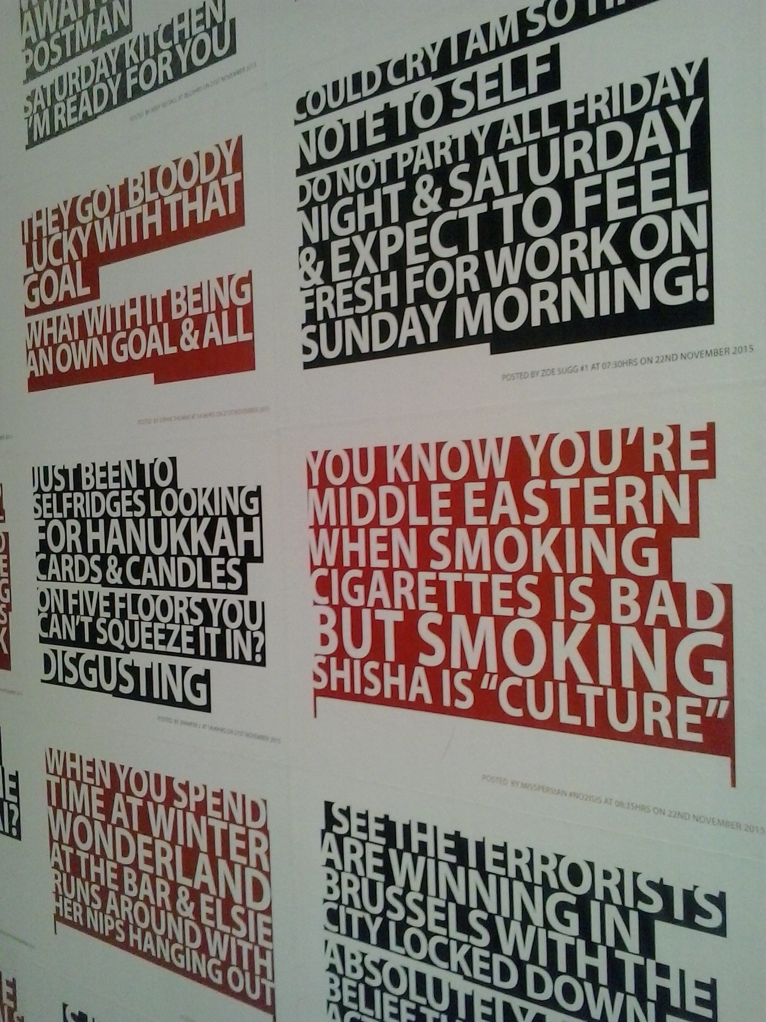
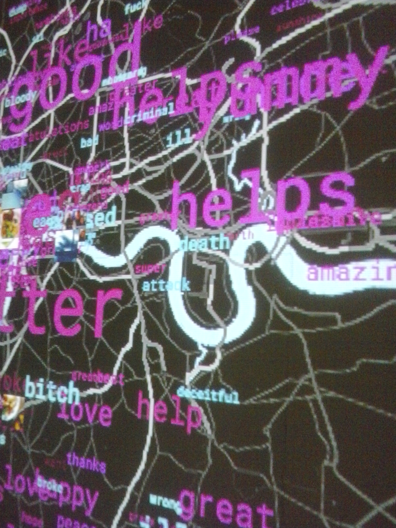
The queuing area of the show, like a satirical Disney ride, was lined with London tweets, such as, “I wish people would stop dressing their cats up” and “when will Britain learn that more war is not the answer”. This was part of the emphasis of the exhibition that data is not just something done to us or about us but, especially since the advent of social media, is what we willingly do to and about ourselves. Despite the sword of Damocles that is risked privacy, we willingly divulge our secrets and our inner most identities over the internet. Hey, I’m doing it now!
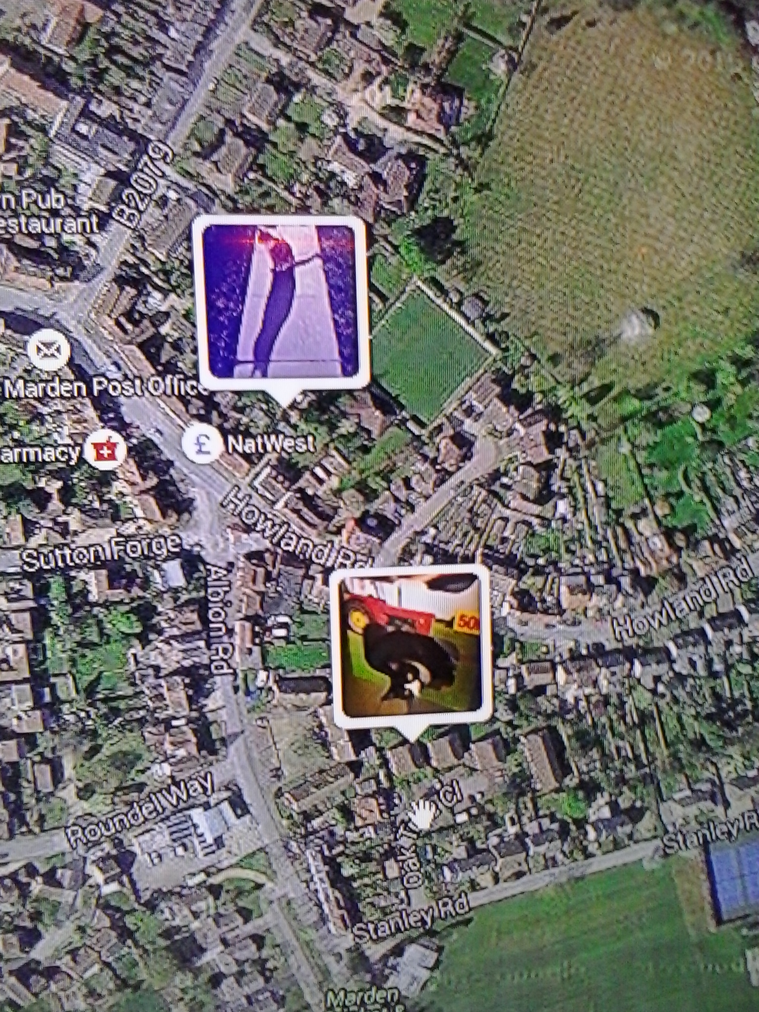
Some other examples of this in the show include the especially commissioned Selfiecity London which makes a data based analysis of selfies, exploring elements such as the angle of the view and whether or not you smile or trout pout in your selfie. Then there is I know where your cat lives. The title of this is, deliberately, sinister and my companions and I were glad that our cats did not show up, though we are guilty of plastering them all over social media. The artist, Owen Mundy, has used the internet popularity of cats as an example of how we recklessly commit our private lives to the global public gaze. If you do recognise your meta-data fixed cat photo on the interactive screen you can remove it by increasing your privacy settings. It is intended as a warning.

The London Situation Room part of the exhibition is based on the fact that the capital of England is said to be the most overly surveillance-loaded city on Earth. But here you can play with interactive maps and stand in front of the data displays to meld into it like a computerised ghost. Live streams of internet data are uploaded onto massive screens all the time. Data is everywhere and nowhere.

What to make of it all? Sinister fun, like a horror film. But perhaps I am anxiously influenced by several other data-related things I have been confronted with lately.
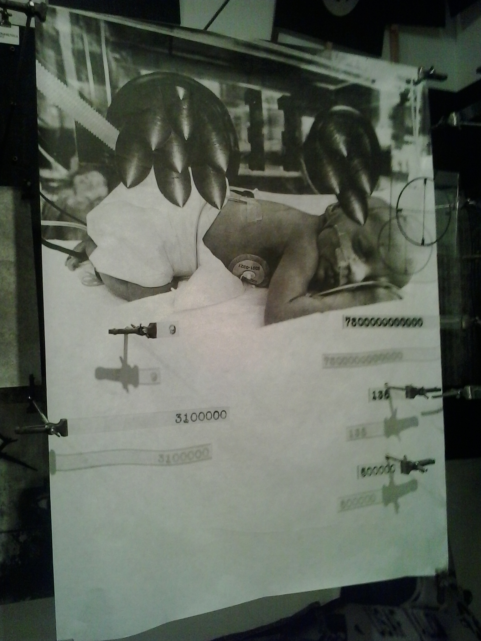
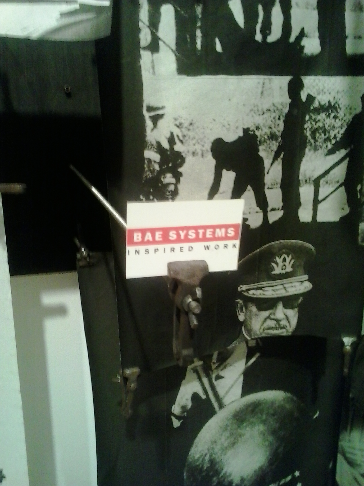
Take for example the fantastic Peter Kennard: Unofficial War Artist exhibition currently at the Imperial War Museum. Kennard’s installation made especially for the show, is called Board Room. Kennard has spent his artistic life as a protestor against war. Moreover, he protests about the people who enable the ability to make war – the arms corporations. Board Room shows his famous photo montage style of shocking imagery. Here we see war-injured children hooked up to drips that pipe directly from oil refineries, or protesters being beaten by police, and premature new born babies in incubators with missiles instead of workings. Here are the aforementioned people, emotions and consequences.
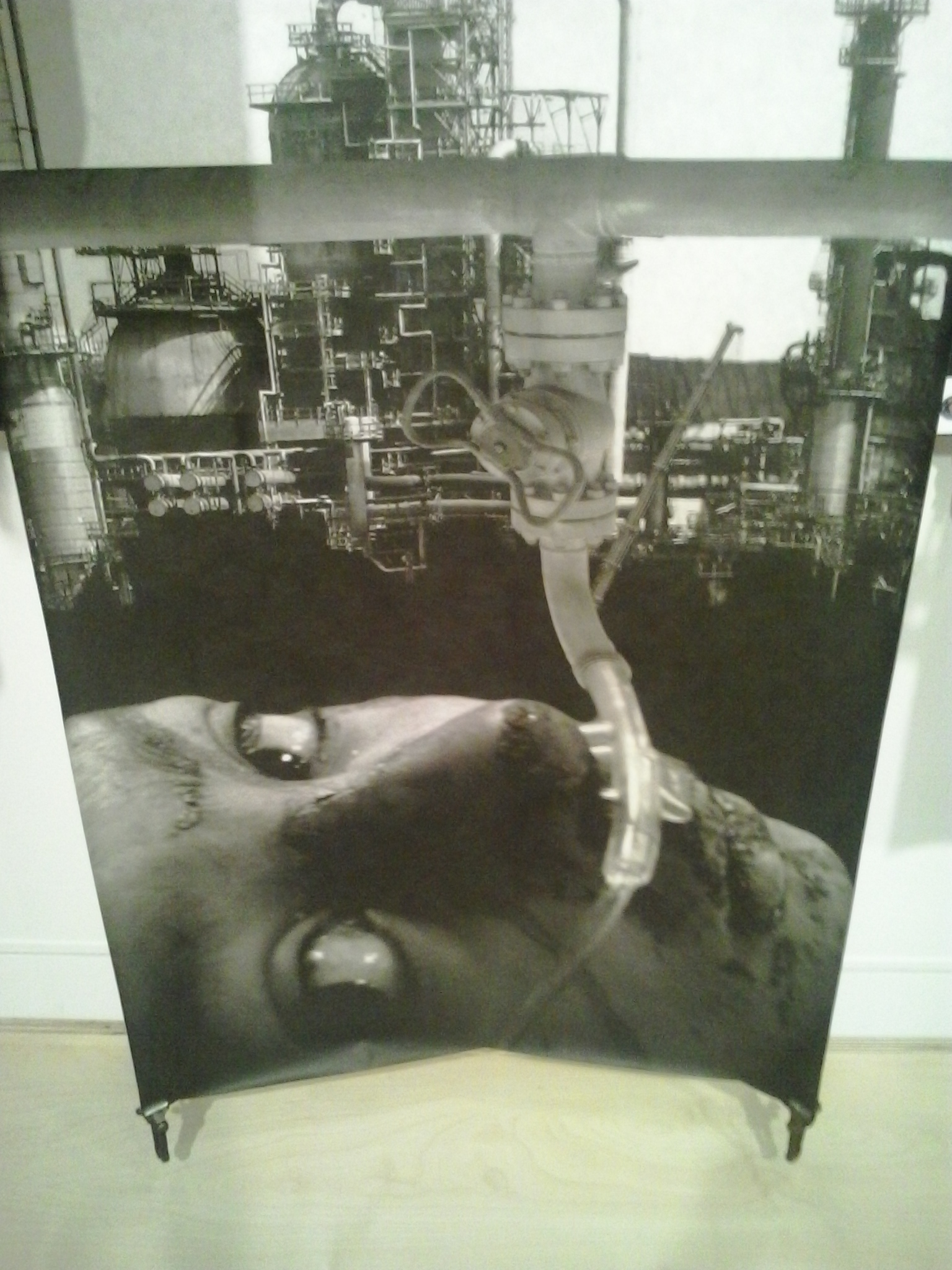

But Kennard also intersperses all of this with data – raw facts and figures, numbers that astound and disgust. Here the data and the context meld to appal. For instance: “3200000000 To feed all 66 million hungry school aged children would cost $3.2 billion a year”. A little further away there is another: “26820000000 In 2013 British company BAE systems’ revenue was $26.82 billion”. Or here’s a worrying one: “11 The number of nuclear weapons the US has lost and never recovered”. “262000000 It is estimated that 262 million people were killed in the twentieth century by their own governments”. And what are these business cards peeking through the misery? Oh, right, the calling cards of the arms manufacturers. They have names straight out of The Terminator; Teledyne Technologies, for instance.

And this weekend a piece of frustrating data: 27 years after NASA attested that climate change is man-made, the US senate still denied it with a 59 – 40 vote. Yet the number of correlating scientific data sets about human-caused climate change is 97% – see the NASA report here. I am quite sure I understand the people, emotions and consequences of that little statistic. One senator still voted to state that climate change is a hoax!
On a happier note, I began to wonder how much I use data in my own everyday life. The thought occurred to me as I was enjoying the twice-yearly Big Garden Birdwatch organised by the RSPB. As I gazed out of the rainy windy into the greyness of the last day of January (weather and date data: check!) I noticed my tally chart. This, I think, is good use of data. A bit of citizen science to help understand bird numbers so that it can be held up against environmental data, including climate change, to understand what is happening to our feathered friends and ultimately to us.

Climate change, war and other “wicked problems” are too data-laden, too impersonal and too worrying for us individuals to feel we can do much about them. But engaging in a small, local act – such as a bit of citizen science like a bird watch or making a piece of activist based art or a blog post – can all help to make us feel the emotion that the raw data might lack and sense that we can at least try to control some consequences. Having a bit of input into some important data can make us feel we are active not waiting for Doomsday.
Ever since then I have been making a mental list (data) about my data usage. My smartphone battery, memory and internet data amounts (something I watch avidly – and I need a new phone so that data will be closely checked); what time I called, texted or Googled; the date on my photos; my GPS situation; bank statements; the tick-boxes about what my students have or have not achieved on their grade sheets; registers; how many applicants for the next run of the courses; my Instagram followers (ouch!); my three votes for Beethoven in the Classic FM chart of the year; my signature on this and that petition; my store card points (yeah, I keep forgetting to hand over my card at the check out); all the unknown-to-me stuff about me on the chip on my driving licence; the book I browsed on Amazon on the side of my Facebook……All of this mundane stuff no doubt recorded and waiting to be held against me somewhere in the future.
Anyway, gotta run…I have to check my WordPress stats!
Rear Window – PETER KENNARD: UNOFFICIAL WAR ARTIST https://youtu.be/2dqN0H1dEVc
Categories: Creativity, Culture, Design, Graphic Design, Reviews, The Graphic Design Project, Uncategorized
