 What is “Design Thinking” and in what ways is it different from ordinary thinking? Can it be said to be a way of being innovative? Or is it more of a workaday process of coming up with a solution to any given design problem? Or is it, nowadays, the art of working with others to help society?
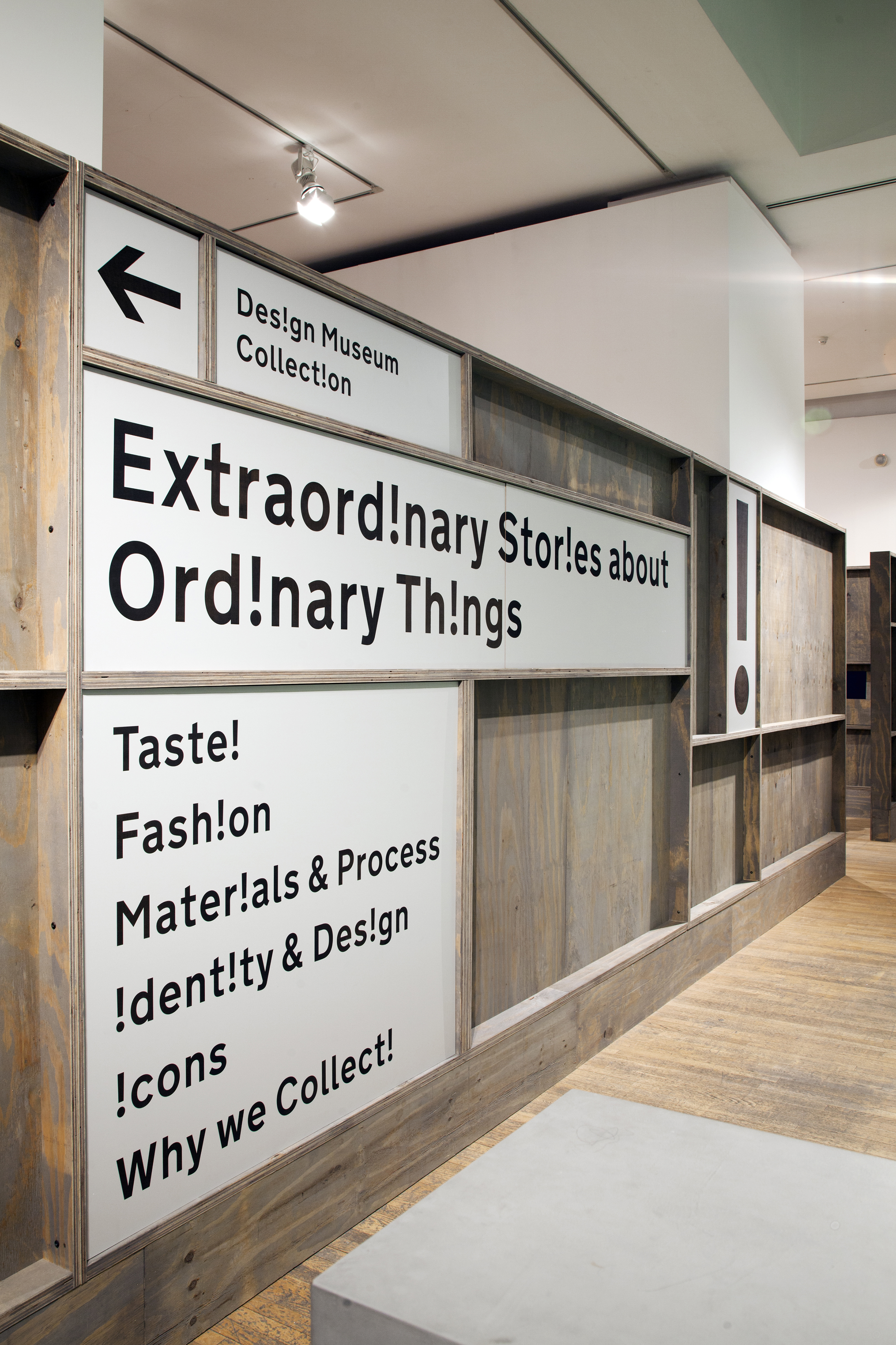
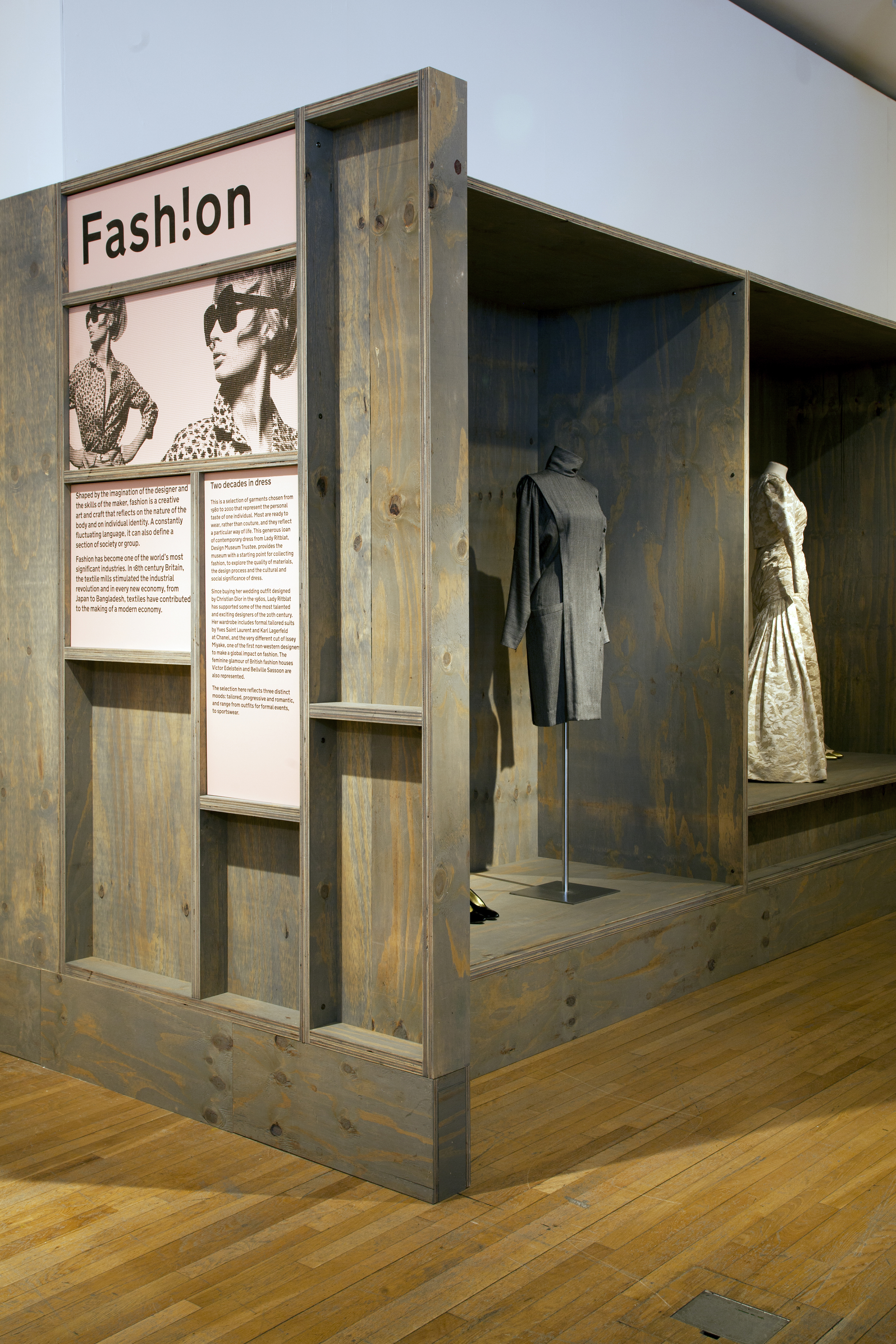
Flavour of the month at GDP is collaboration – in education, in design, in exploration, in collectives of artists and illustrators…It’s featured large in things we’ve been studying and seeing in exhibitions. So we went to the Design Museum to see Designs of the Year and Extraordinary Stories about Design Objects. We enjoyed these displays very much because they were really fascinating and emphasised the threads that run through all design, such as collaboration but also things like memory, use, taste, colour and texture. Talking of which, when we entered Designs of the Year I did wonder for a while if we were in the wrong exhibition because style and colour-wise everything looked as if it had come from the 1950s. However, things have moved on abit since then…
What we found most interesting was that most of the design we saw could be roughly dumped into the category of a) really useful, helpful and worthy (design for society) or b) slightly arty, entertaining and fascinating. Some of the park and museum design crossed both categories quite effectively.
In the first category you could include the winner of Designs of the Year, the UK government website designed by Ben Terret. Not the most extraordinary design ever; not “designy” in the sense of design gives it trendy value, but just a clean, simple, straightforward and easy to understand piece of design that is user friendly. The typeface is based on the one used for road signs (which we saw later, upstairs). This is so that everyone using the website would be able to access it for legibility without any issues. In the museum display the website also showed us how many people were currently renewing passports, looking at benefits advice or buying a car tax disc….”boring” facts that magically became fascinating in their own right. The old design saying that a design is not finished until everything that can be taken away is indeed taken away applies here – no clutter, nothing to confuse or distract.
Also in the useful category I included an armature made by 3D printer for children with muscular disabilities, anti-diarrhoea packs, specs with liquid filled lenses that had crazy little pumps on each side (which are cheaper than glass lenses and therefore useful in places like Africa and Asia), and a folding wheel (someone had to re-invent it sooner or later).
In the entertaining section were several apps, such as one to encourage lazy runners by convincing them that zombies are chasing them and one that makes a lovely hedgerow plate come to life (though I’d be put off by a squirming caterpillar on my dinner plate). There was a wind map of the US with little white lines showing the direction of the prevailing winds – no wonder they call Chicago the “windy city” as all the lines seemed to end up in that region. There’s a lot of daft and frankly ugly fashion on display, including a polka dot tentacle monster consuming Kusama. But the new Nike stringy running shoes were good, though not as good as their promotional wire/wool sculpture of an unravelling runner.
My favourite entry in the display was the box of objects from the Museum of Innocence. This is a Nobel Prize winning novel by Orhan Pamuk with a matching museum in Istanbul. The museum supposedly displays objects used by the people in the novel’s love story. I bought the book, The Innocence of Objects, about the museum, which is truly fascinating in its own right, detailing how Pamuk bought the museum building and gathered the objects. I was reminded of two of my other favourites, Susan Heller’s From the Freud Museum vitrine artwork (sometimes in a museum and sometimes in a gallery deliberately confusing art and museum curation) and Nick Bantock’s mystery clue book, The Egyptian Jukebox, both of which gather collections of objects as clues to a fictitious story – or not. All three of these works jumble our thoughts about display and what the objects represent or mean. The juxtapositions of them also help this appealing confusion –the viewer makes assumptions that end up as individual stories playing out in our heads. There’s definitely a GDP project brewing here!
I’ve just been reading an Open Learn project that discussed the boundaries that design exists within. Look around and see if you can see anything in your room that isn’t designed. Even the plants in your surroundings you might have at least been placed as a form of design in a pot in a specific corner of the room or garden. And your dog has been bred to a mankind-pleasing design for hundreds of years.
Design exists within legal frameworks of what can and can’t be made, as well as traditions or conventions of what is done and what is not. The readings I was doing explored how even acts like walking are governed by design parameters; where you can walk (barriers, road signs, kerbs, pavements, private places). I’ve been applying this to graphics, thinking about how something like an issue-based poster for a charity or a magazine double page spread is governed by legalities and what is considered acceptable. Think about charity advertising, like the Barnardos Silver Spoon campaign (here and here)which was trying to help children born into poverty but which upset the very people it was supposed to help who felt that showing syringes and cockroaches emerging from the mouths of new-borns (instead of the proverbial silver spoons of the rich) simply labelled them a dirty and drug addicts. Imagine if you were commissioned to design a layout for an article about a very sensitive issue such as racism, bullying, dementia, alcoholism or domestic violence. How would you acknowledge the legal issued and especially the usual “ways of doing things”, the conventions?
I think that the winning website design thought about these parameters very effectively. Convention might be seen as boring, but the logistical need for simple, understandable operation has over-ruled the desire to be designy and has enabled a design of great functional beauty. Remember what William Morris said – “Have nothing in your house that you do not know to be useful or believe to be beautiful.”
And talking of Design Thinking, whatever it means, there’s been a call for it to be scrutinised a bit more and put under the glare of its own rules. You may like to see this (well-designed) paper on the topic from Fahrenheit 212. Overall, design is about people; to help us live our lives more easily, even if that is simply to entertain and soothe us.
Find links here to the Design Museum’s Designs of the Year and Extraordinary Stories.
Large Image courtesy of the Design Museum Press Office; Photos by Luke Hayes
Categories: Design, Reviews, The Graphic Design Project
